


31
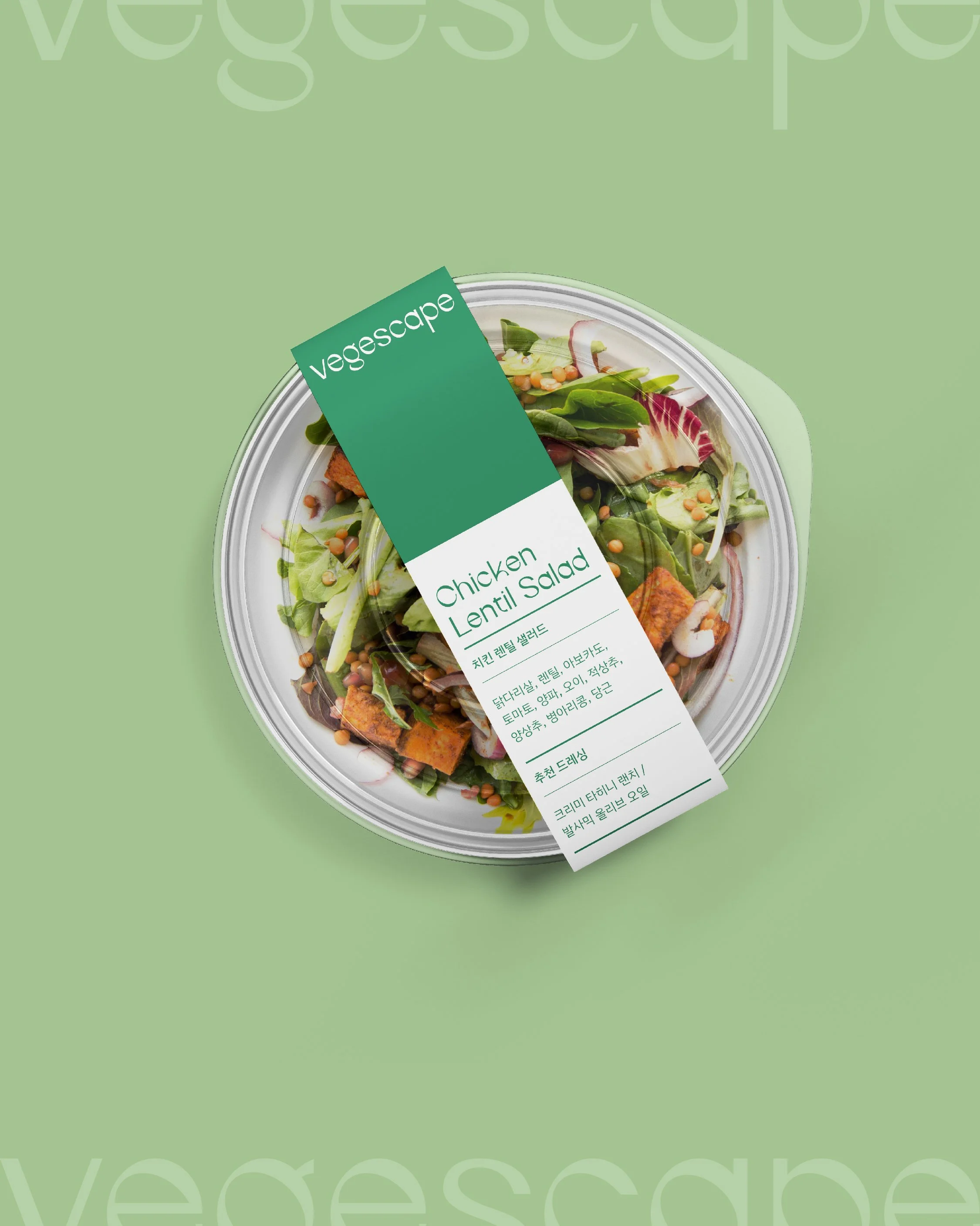
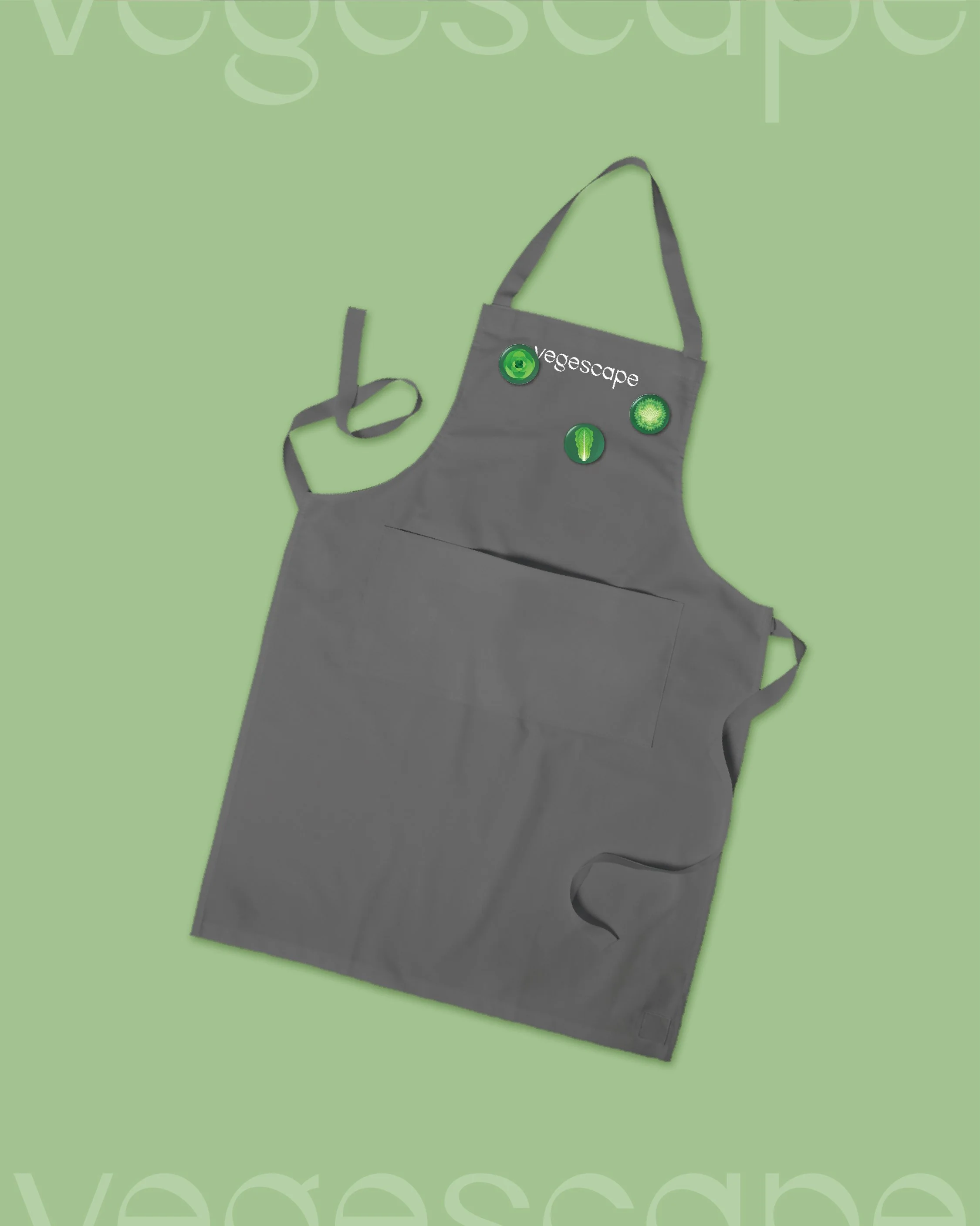
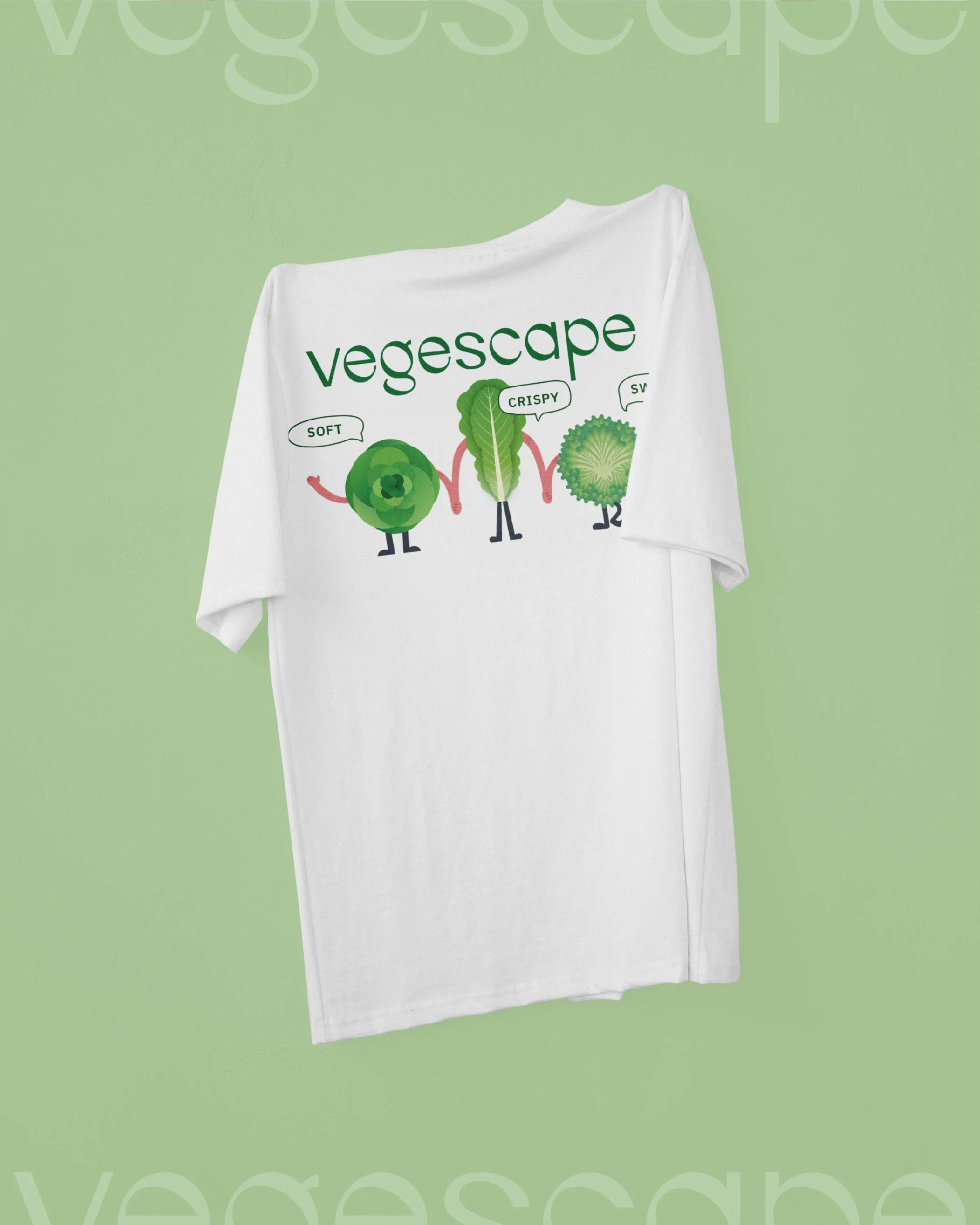
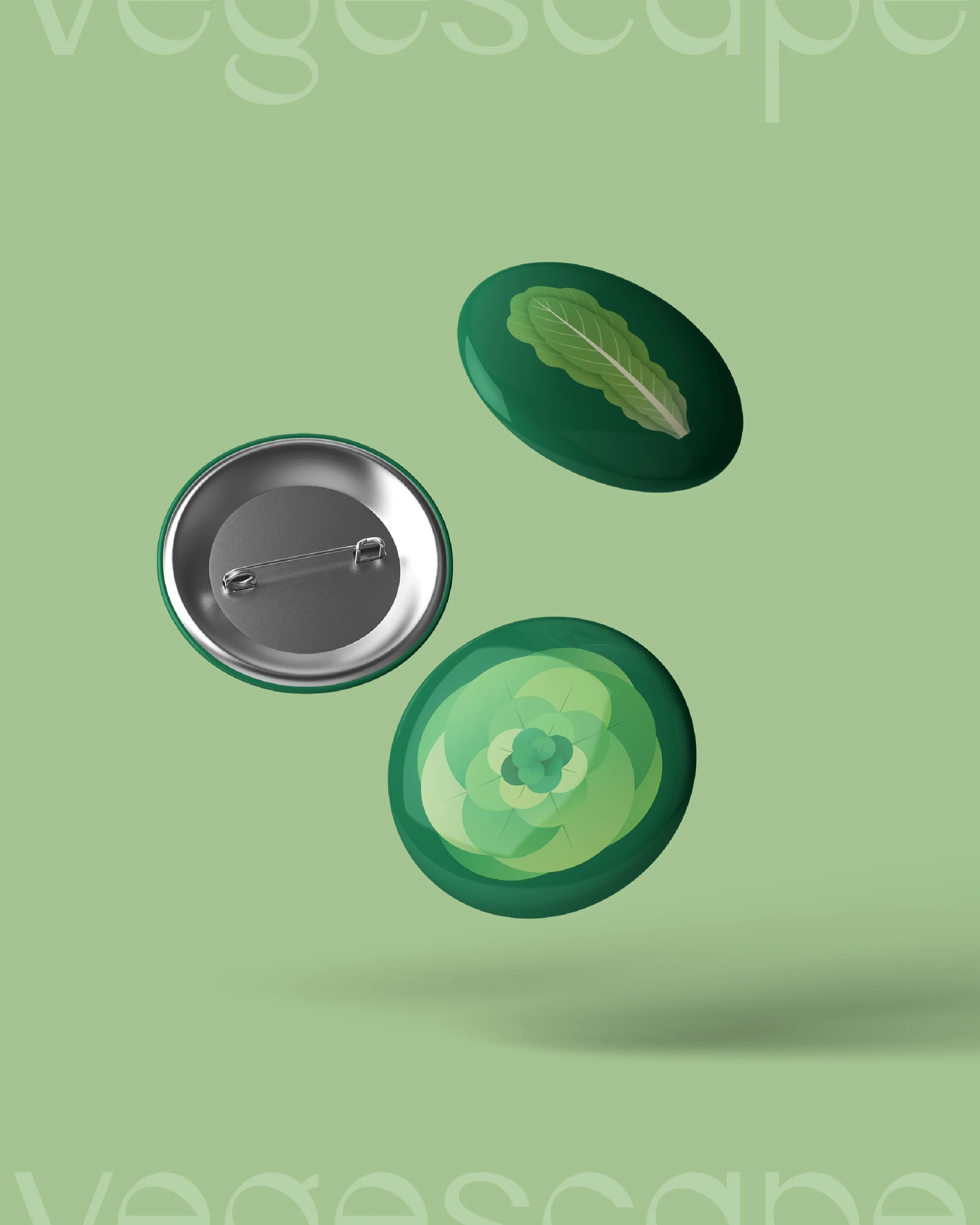
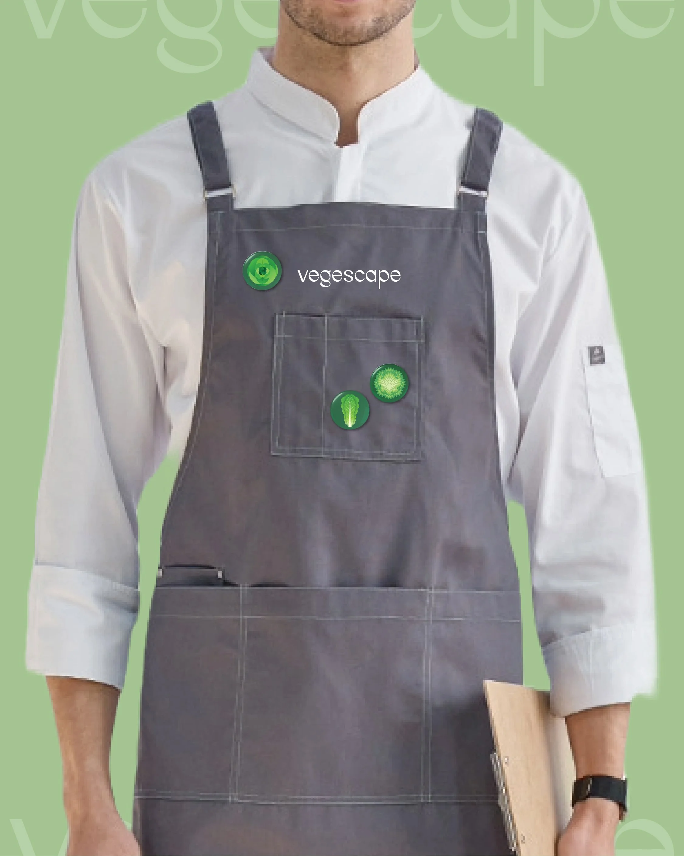
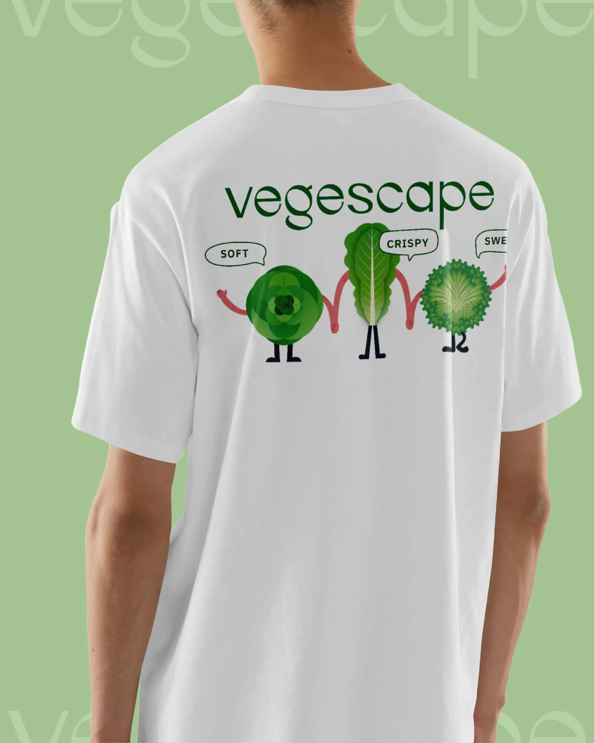
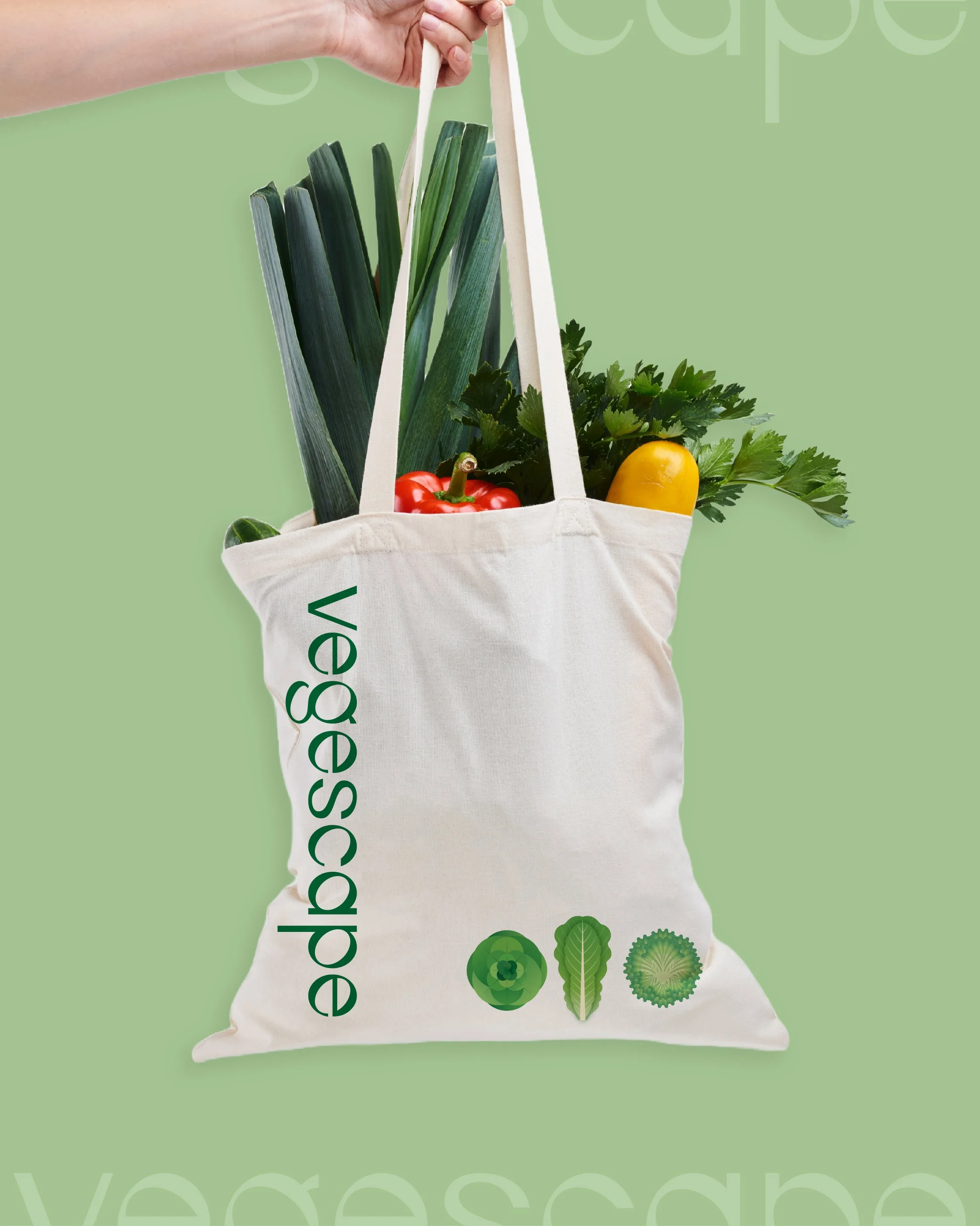
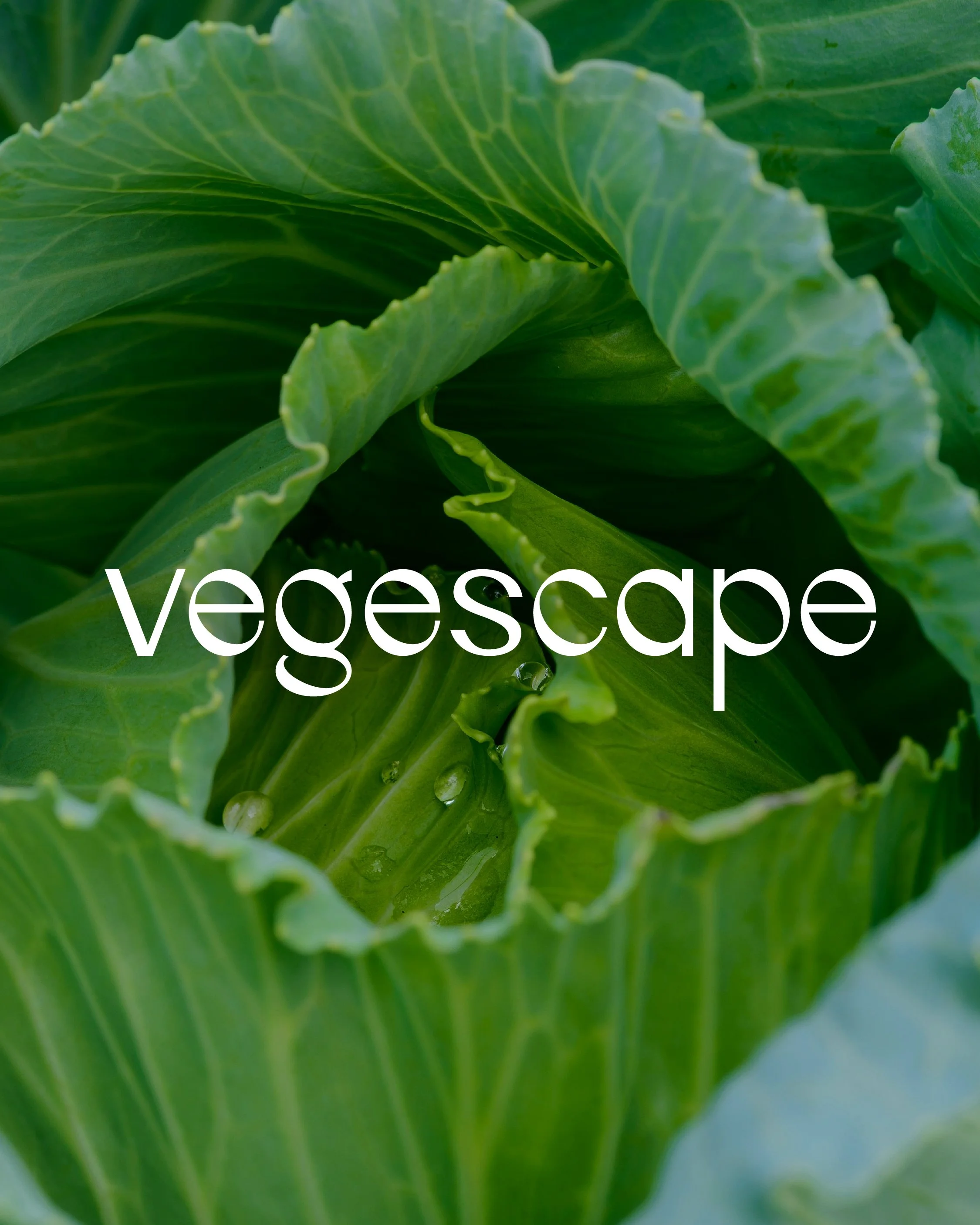
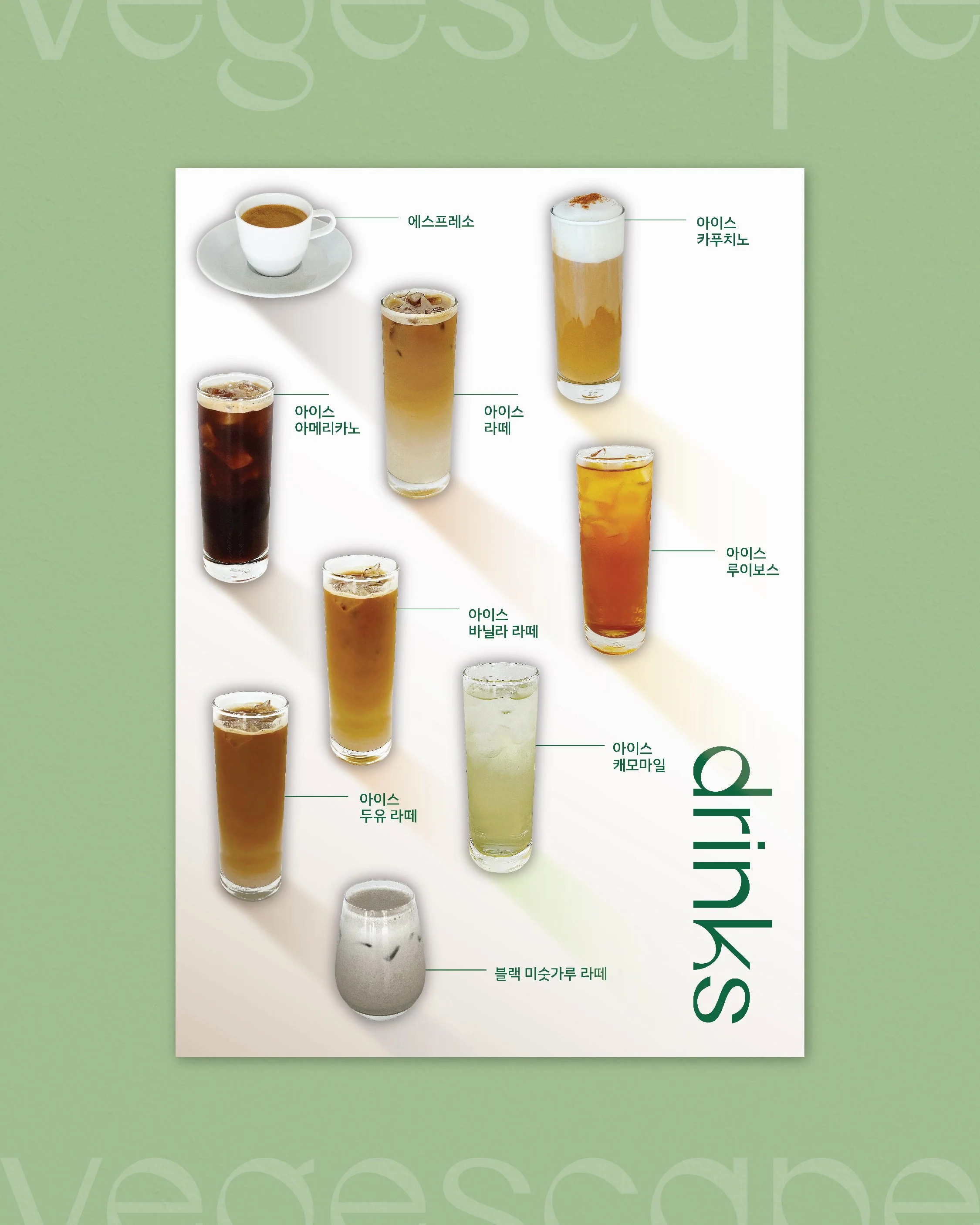
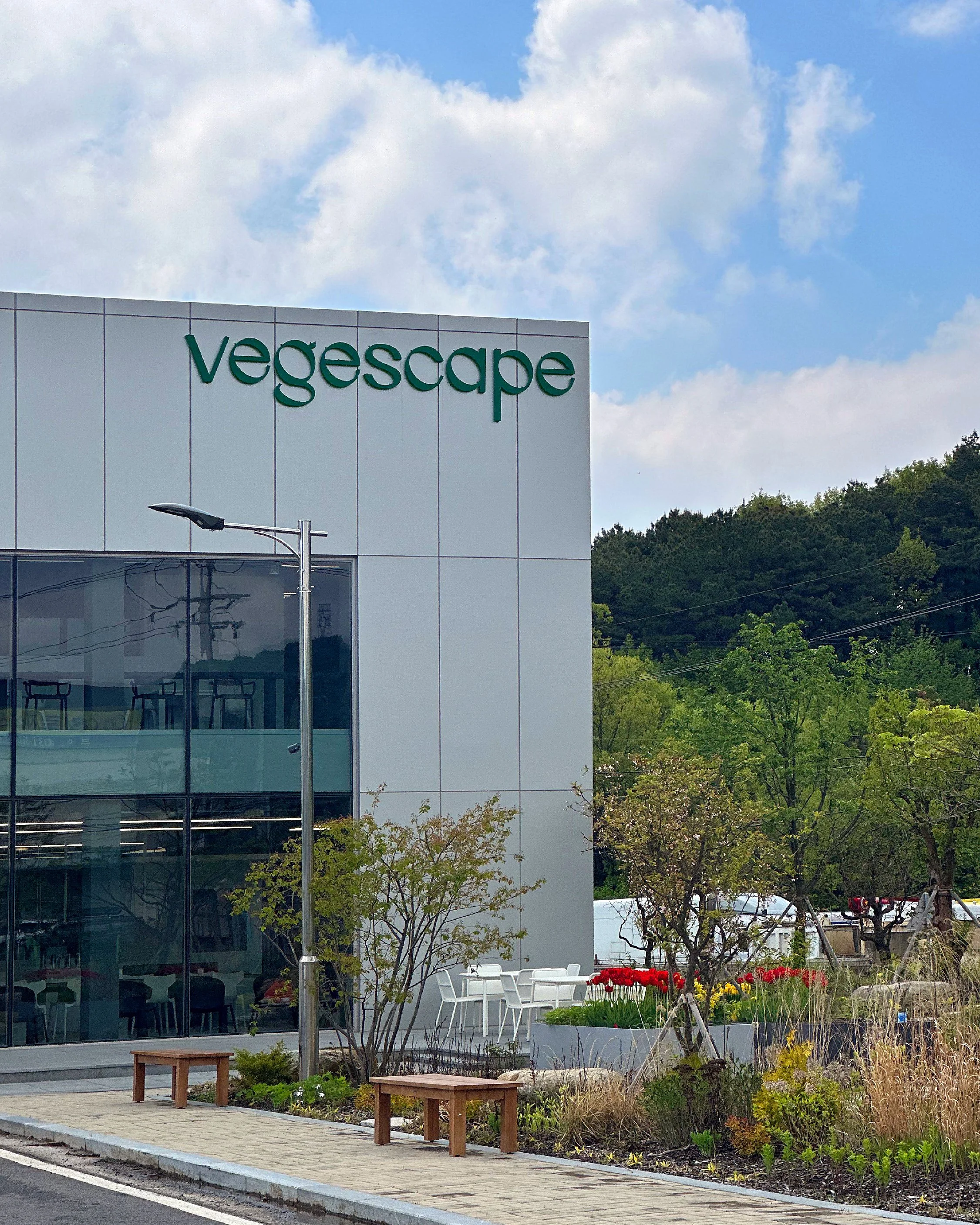
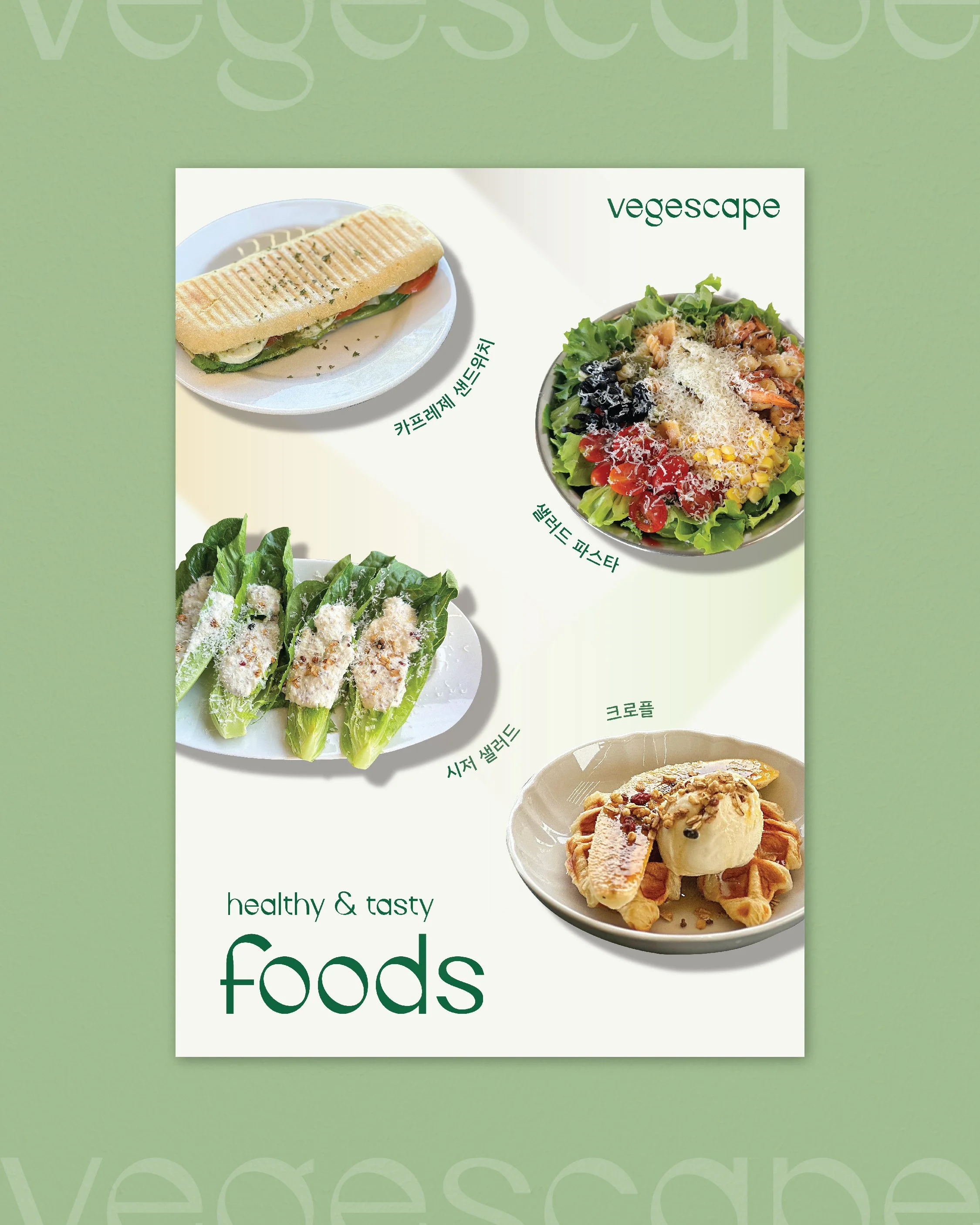
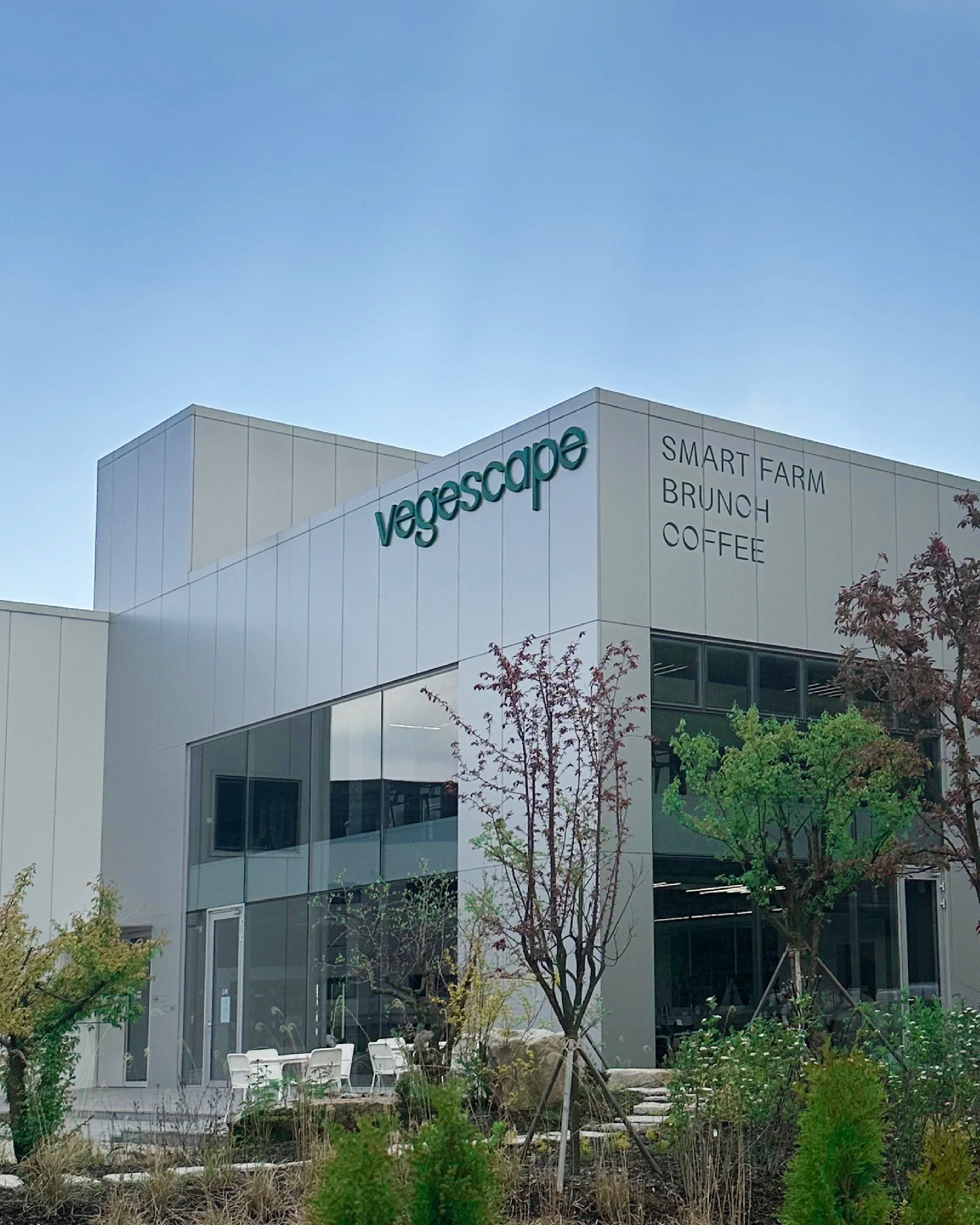
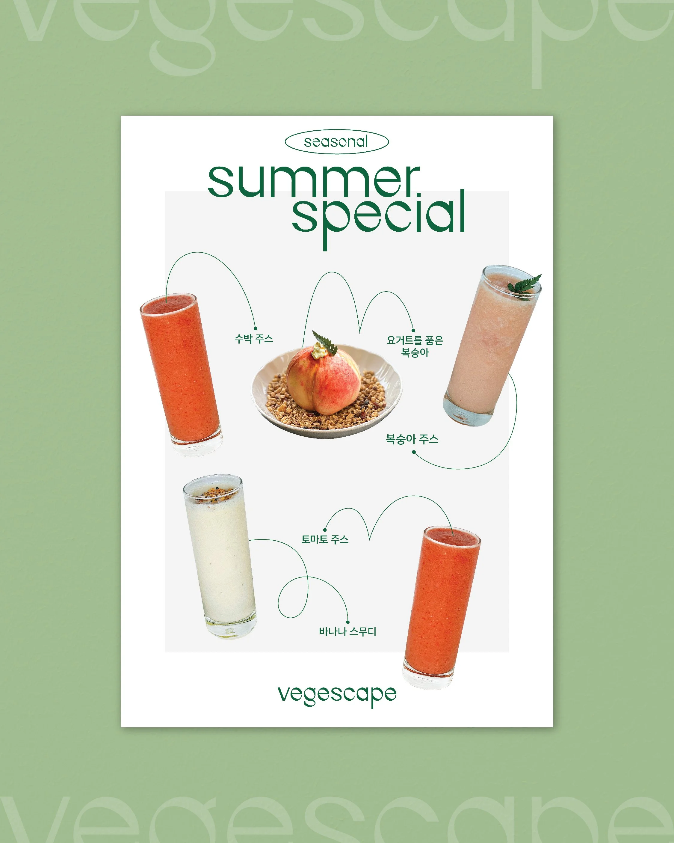
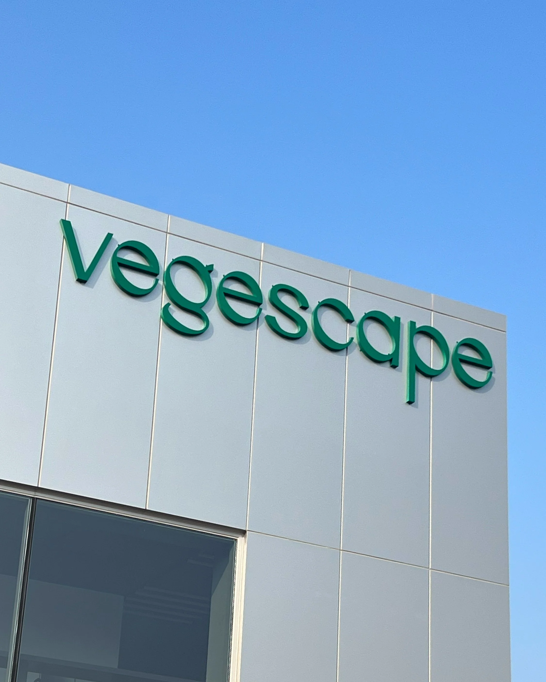
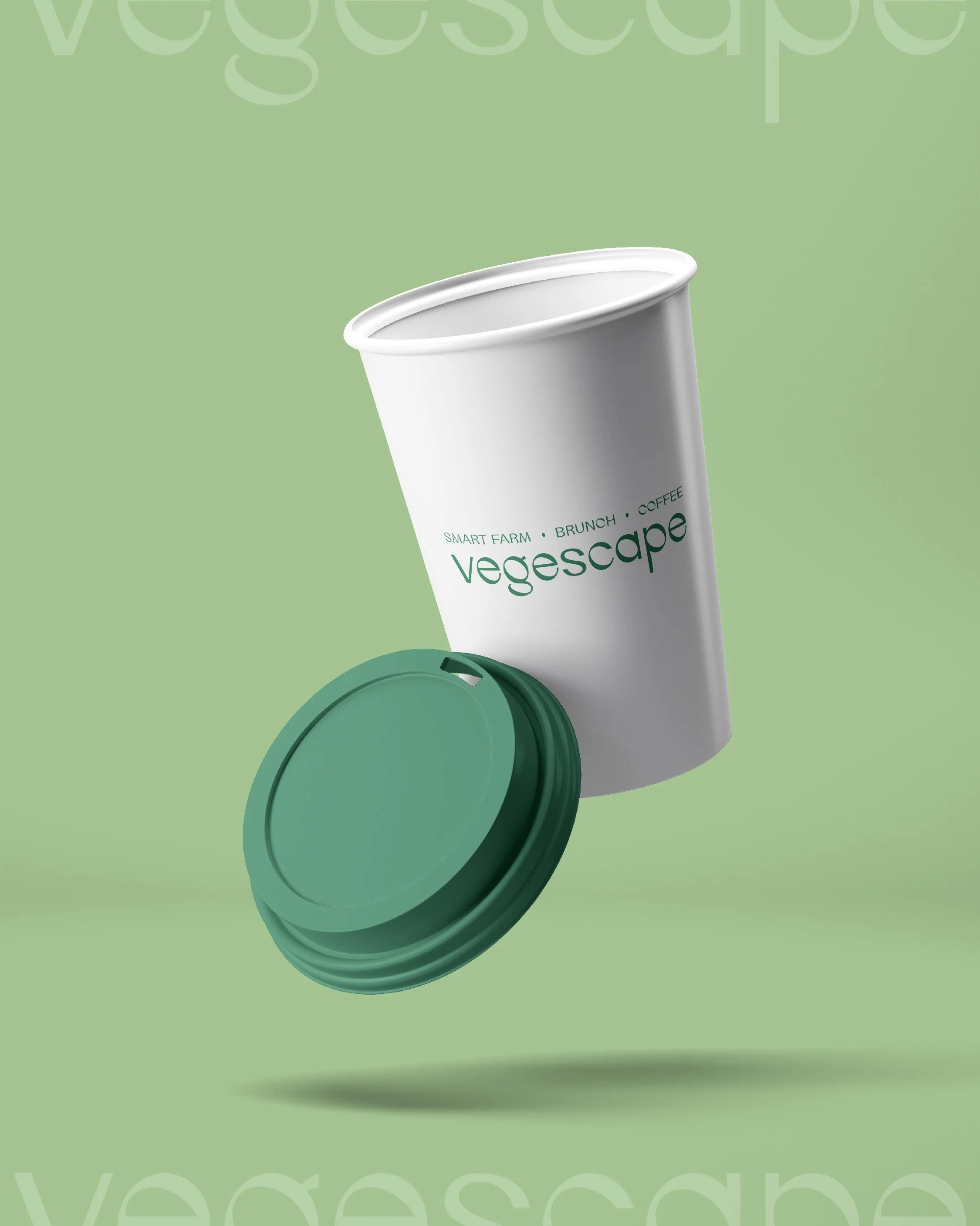
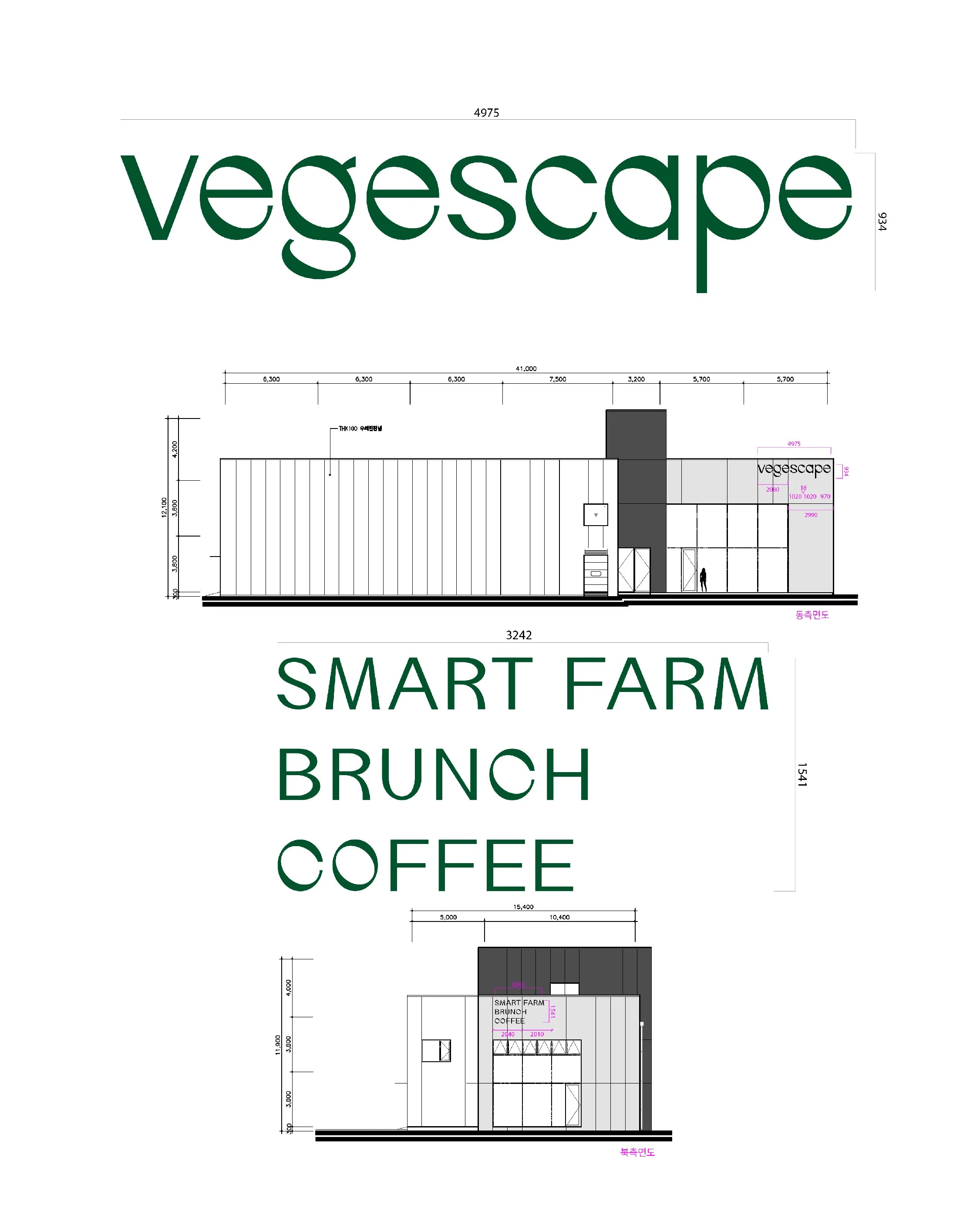
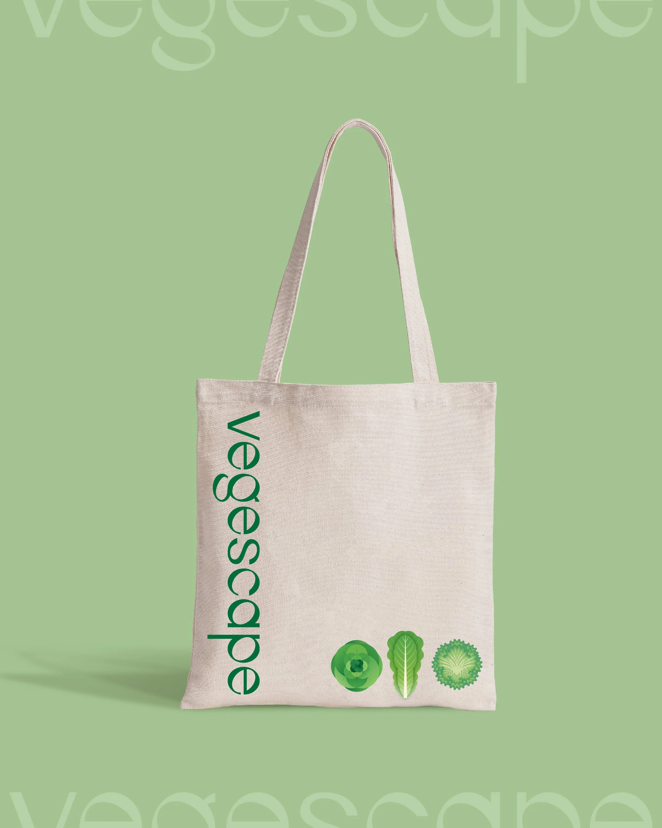
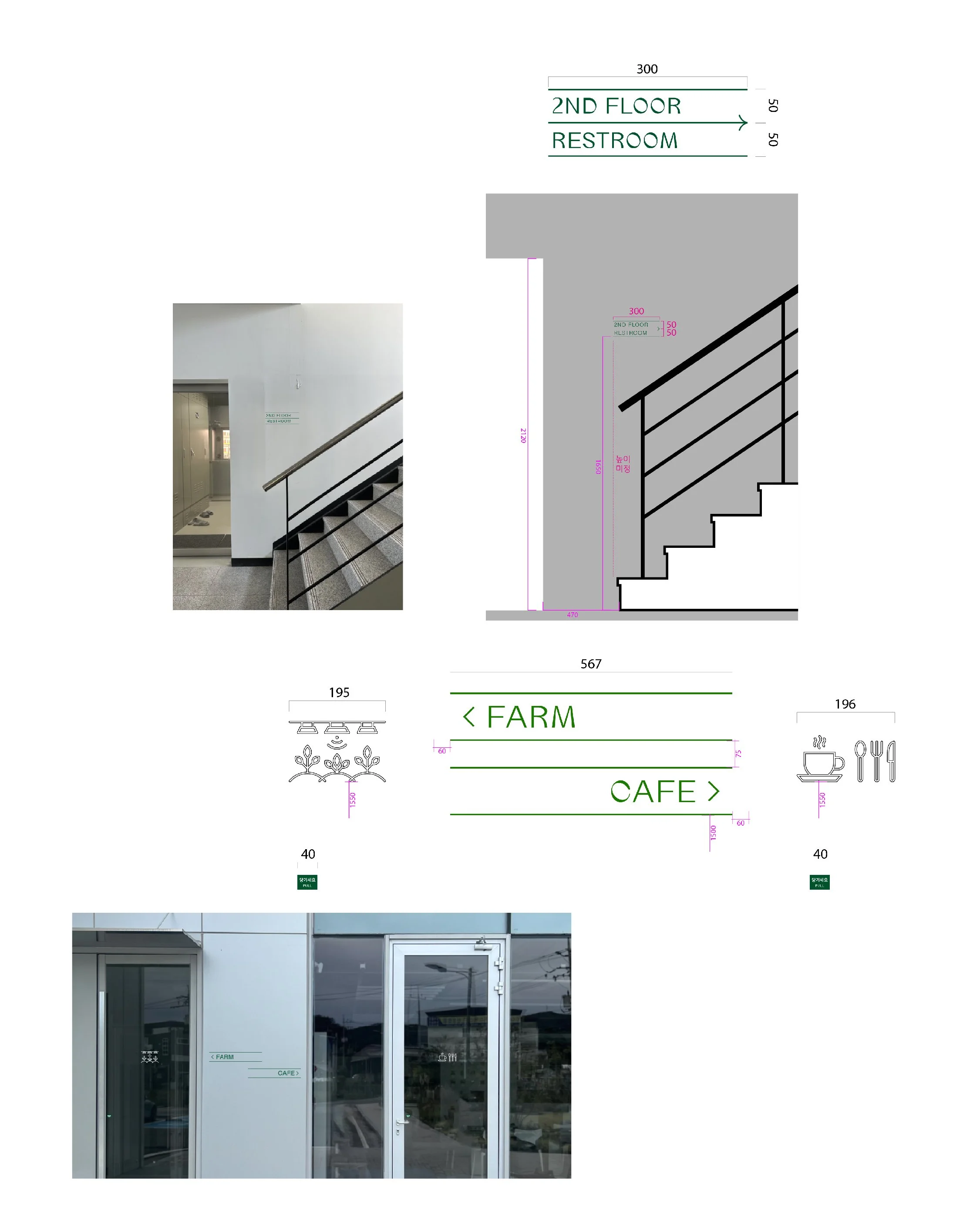
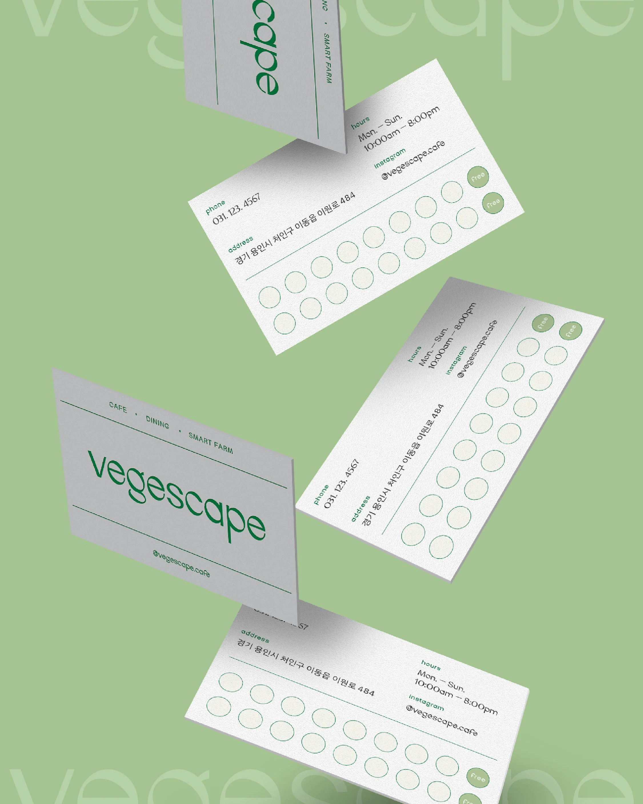
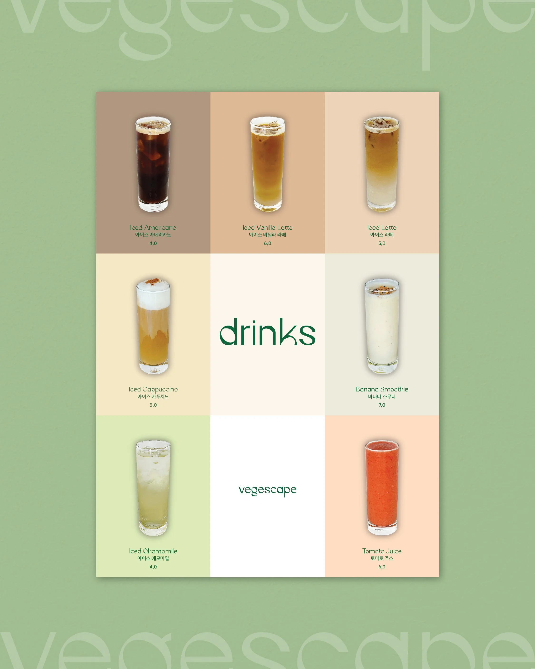
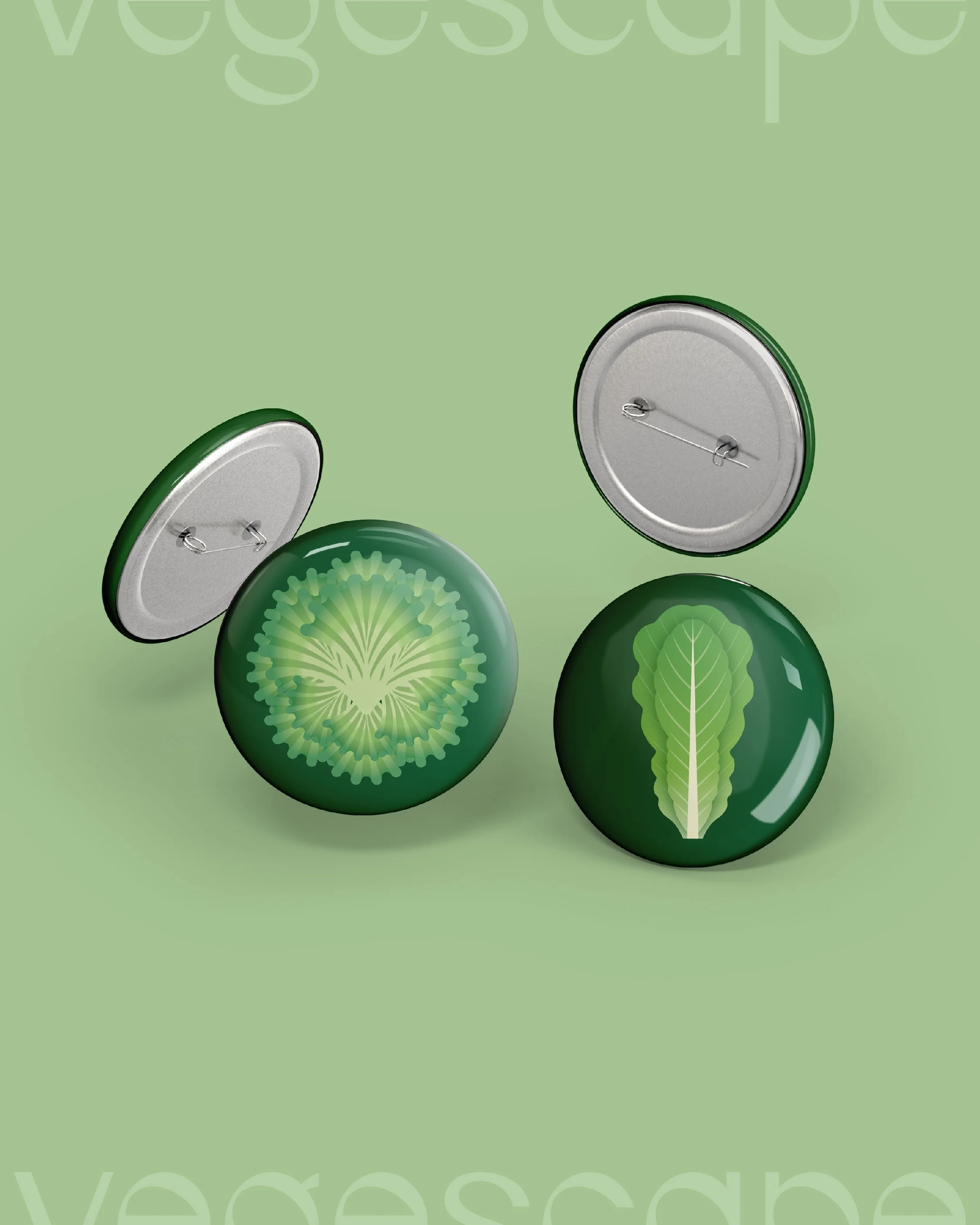
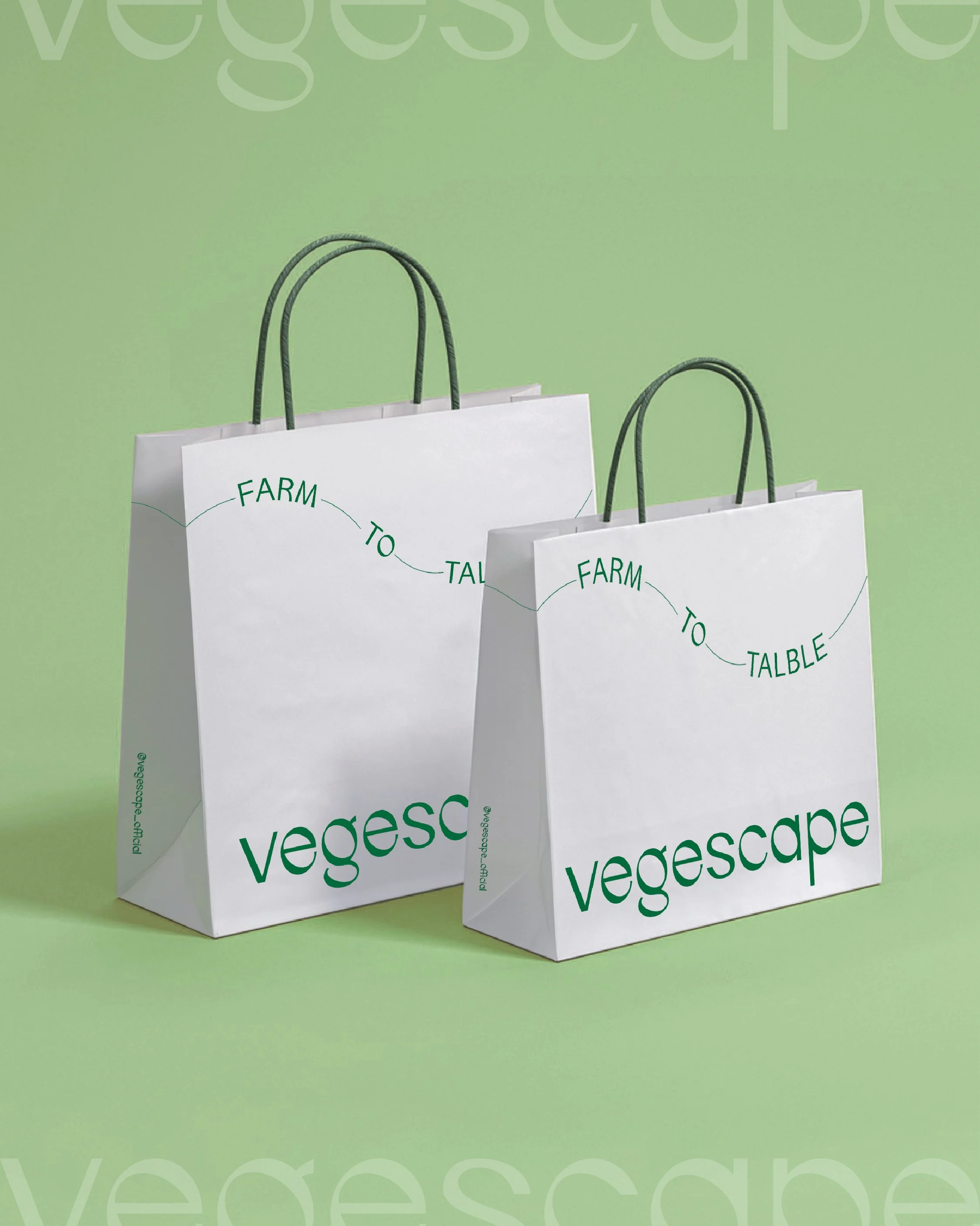
Vegescape
7
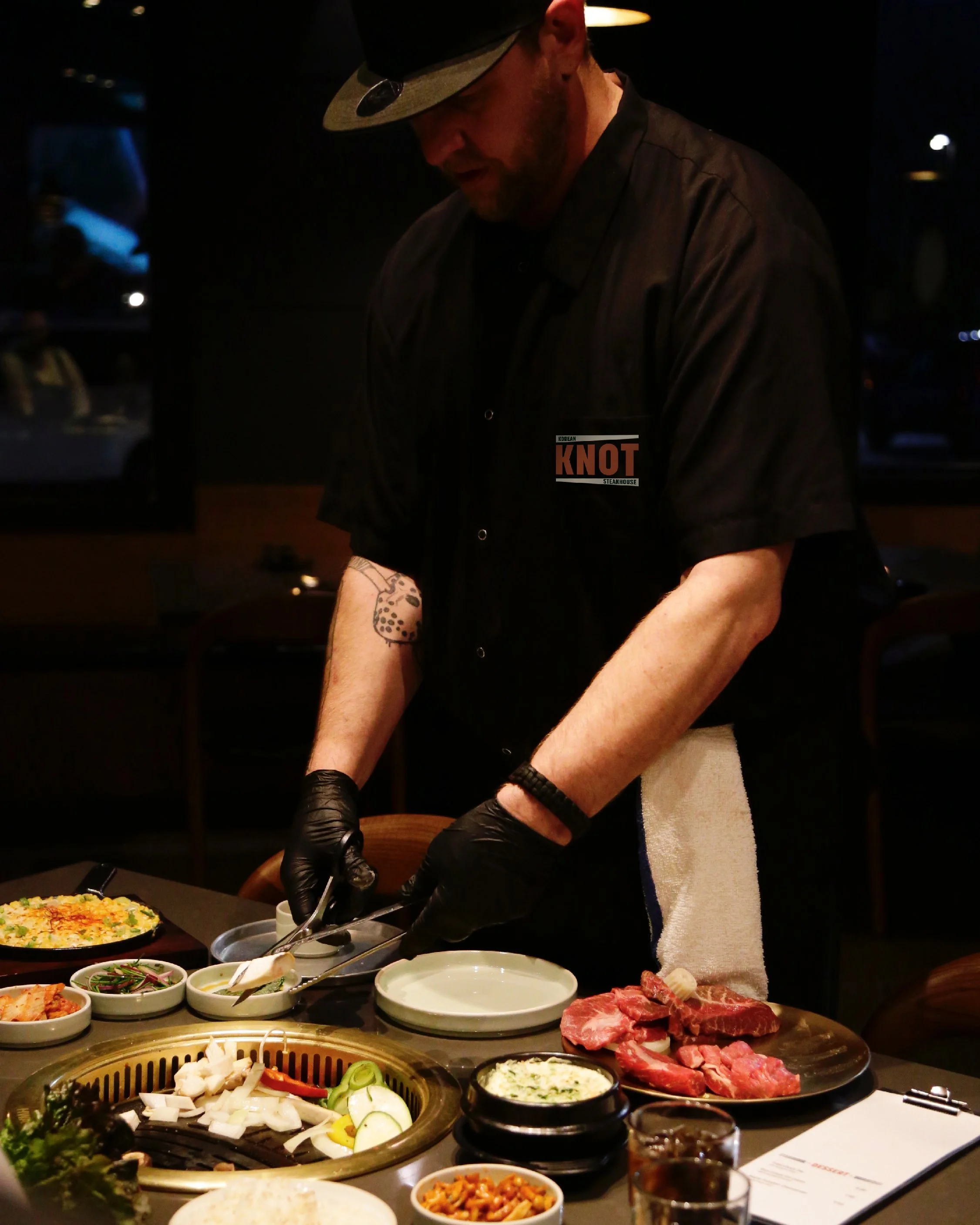
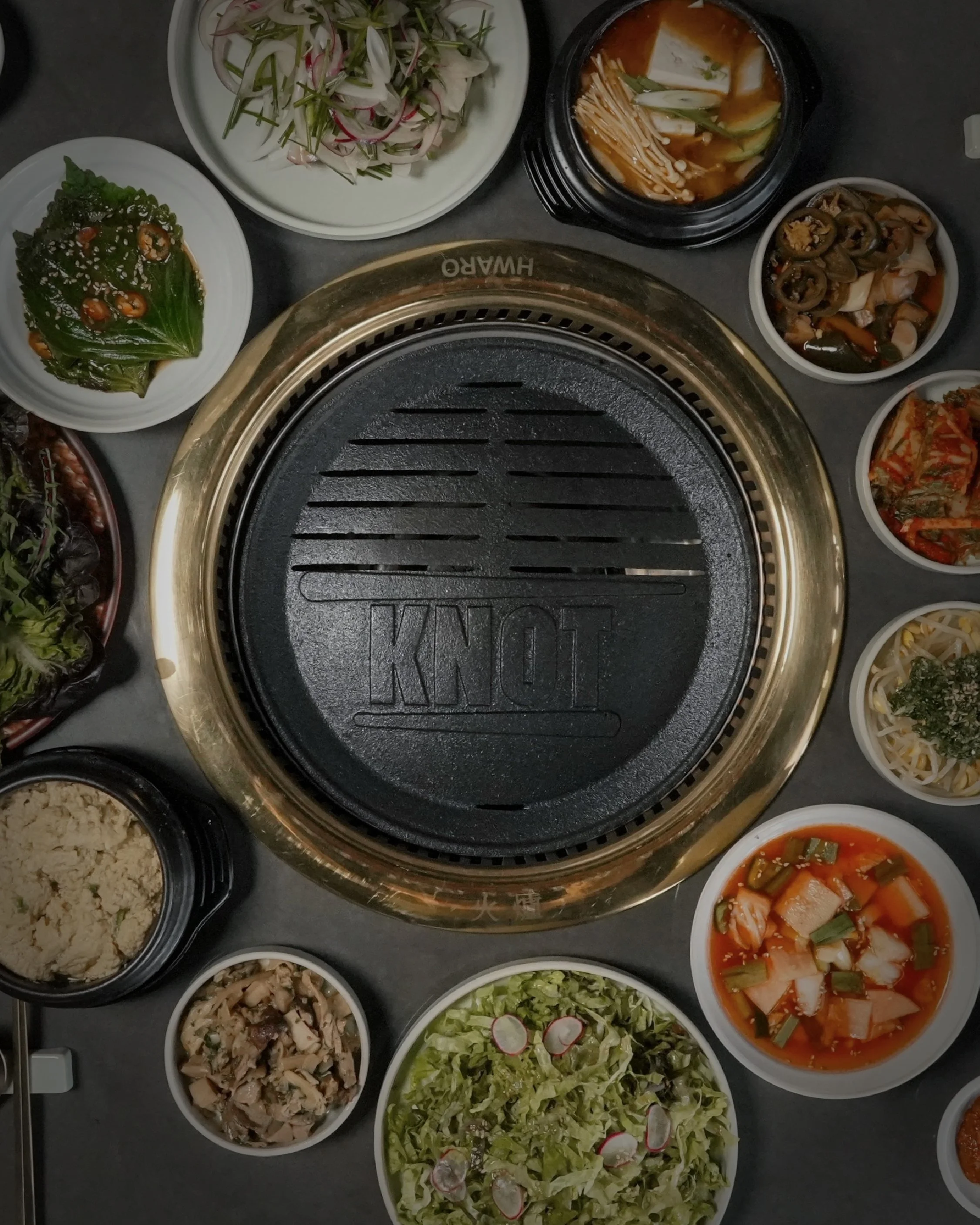
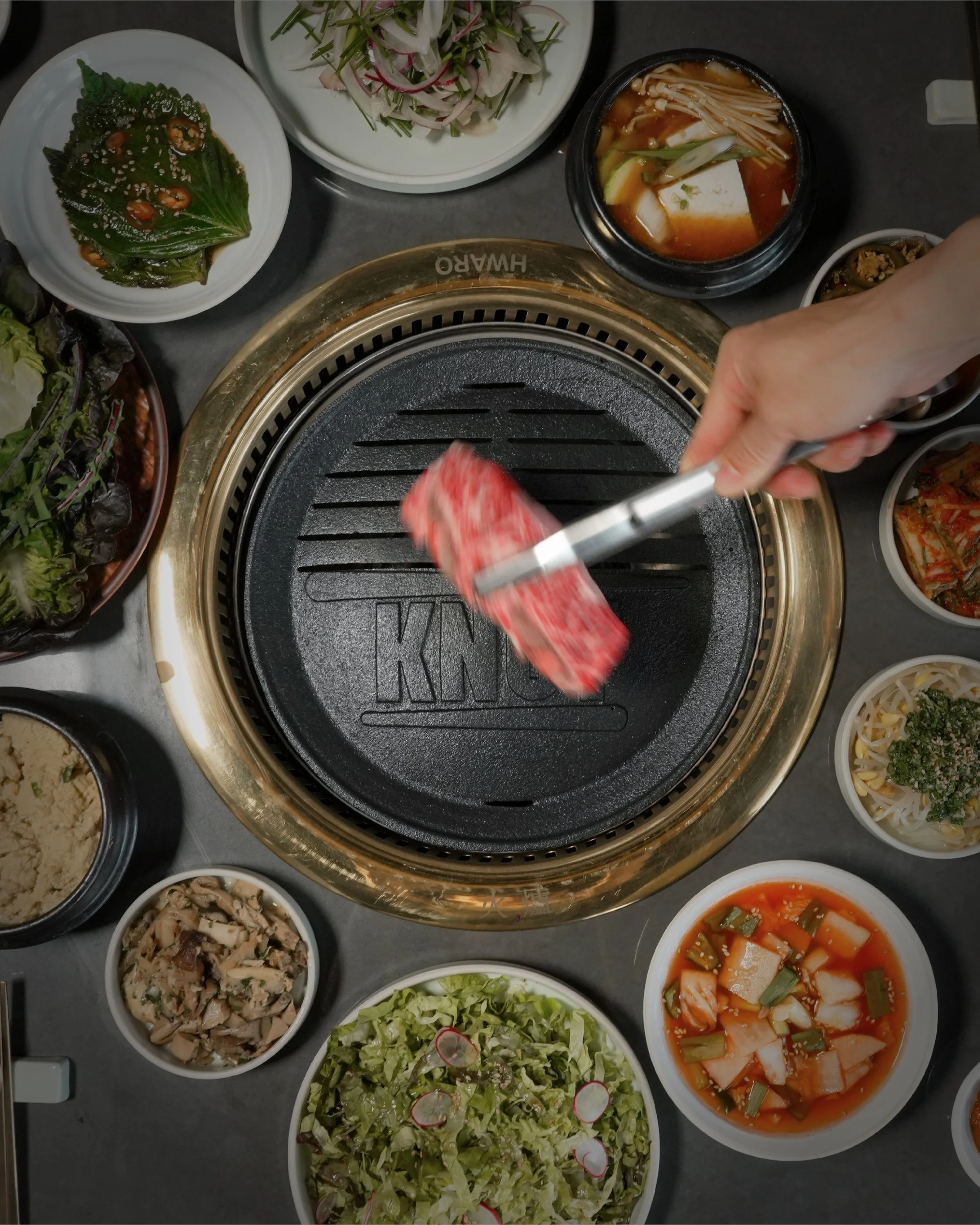
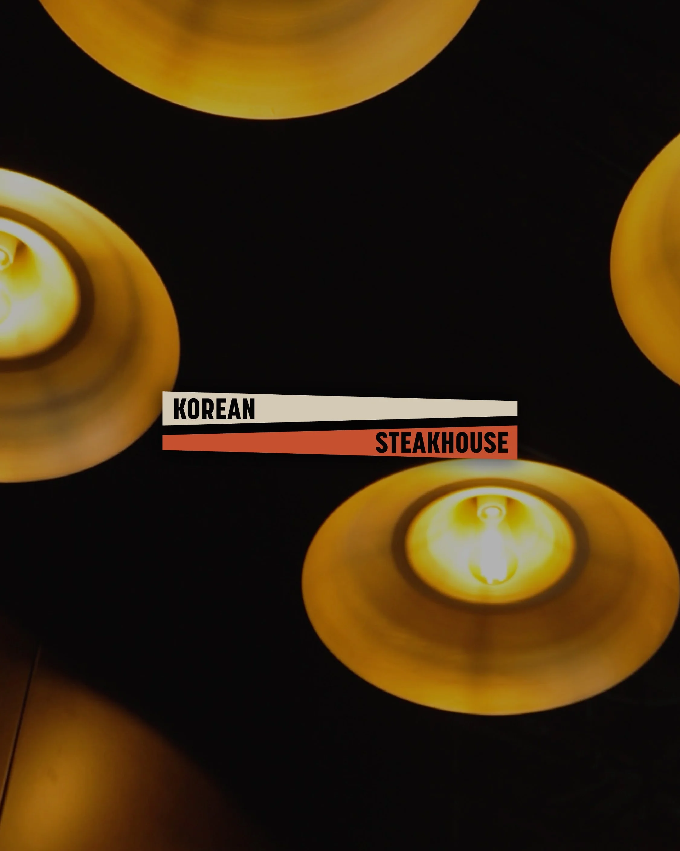
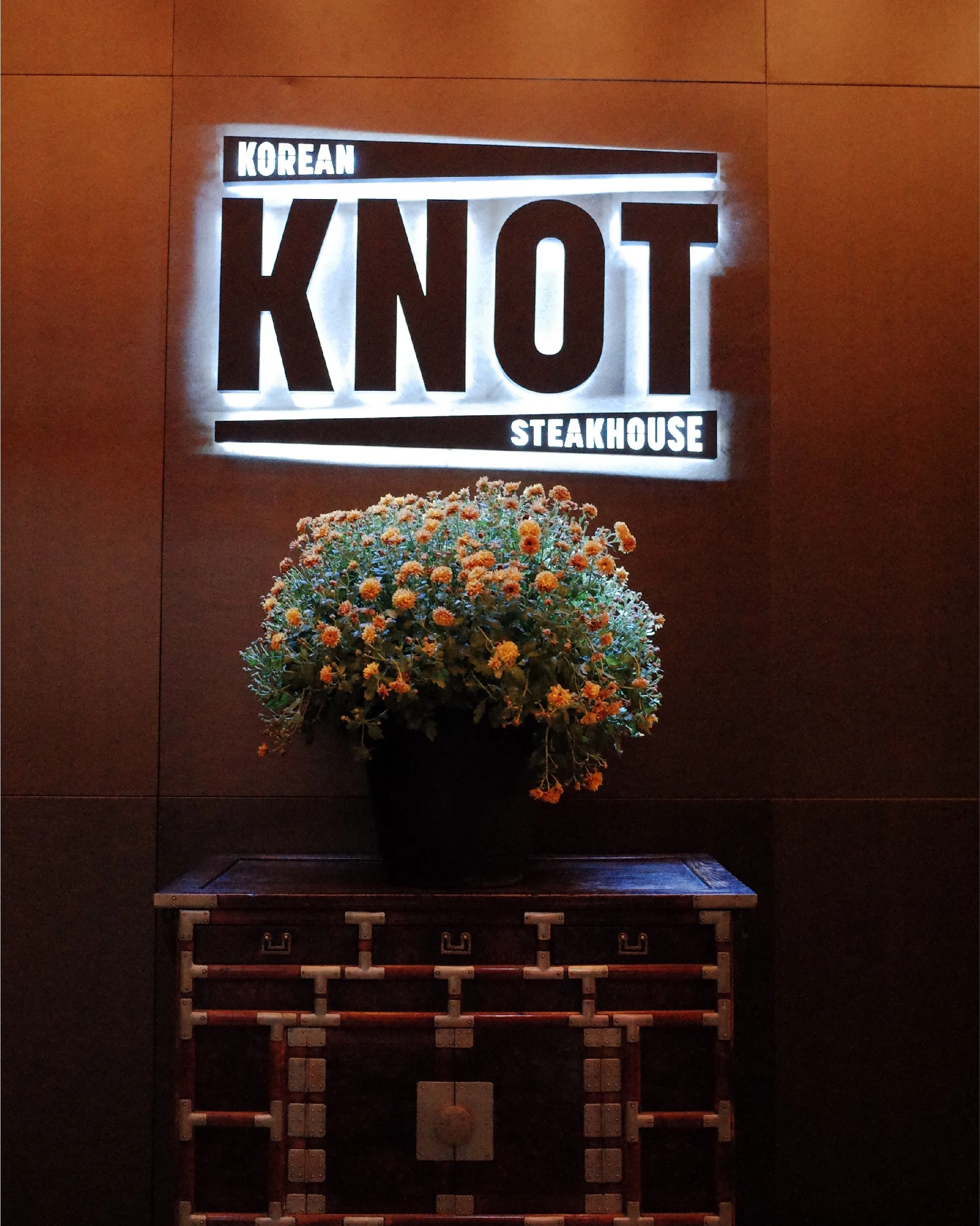
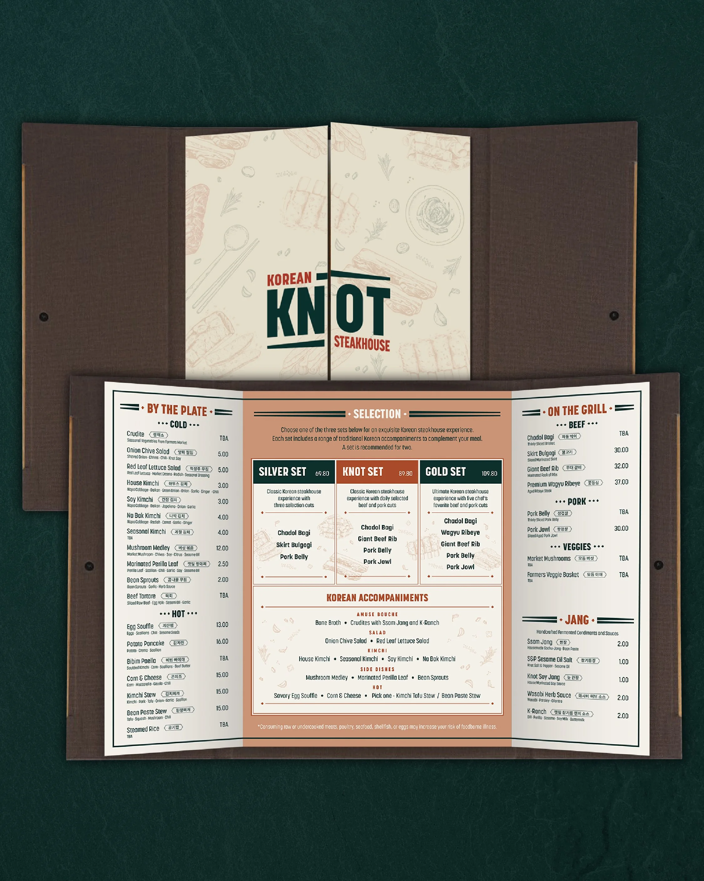
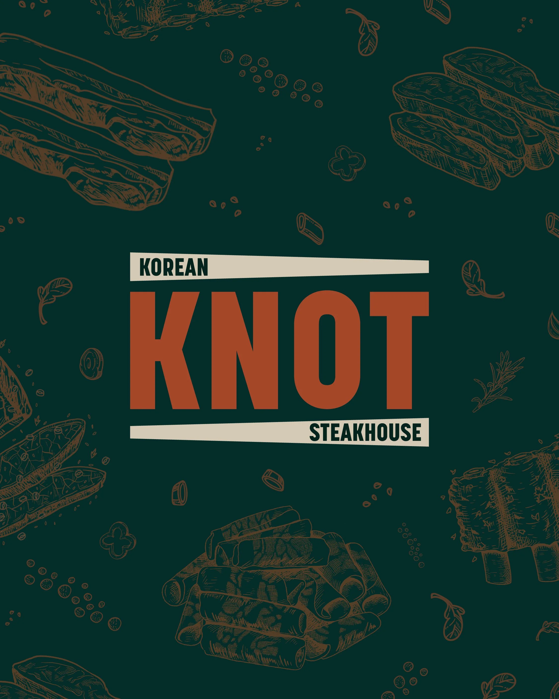
Knot Steakhouse
4
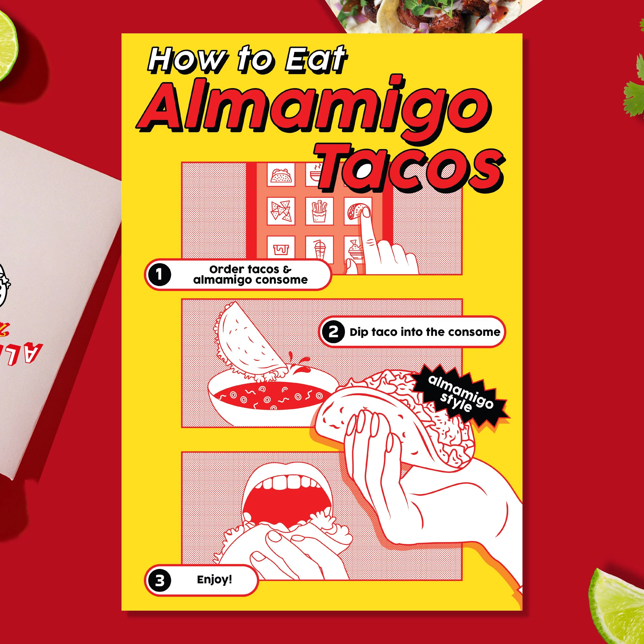
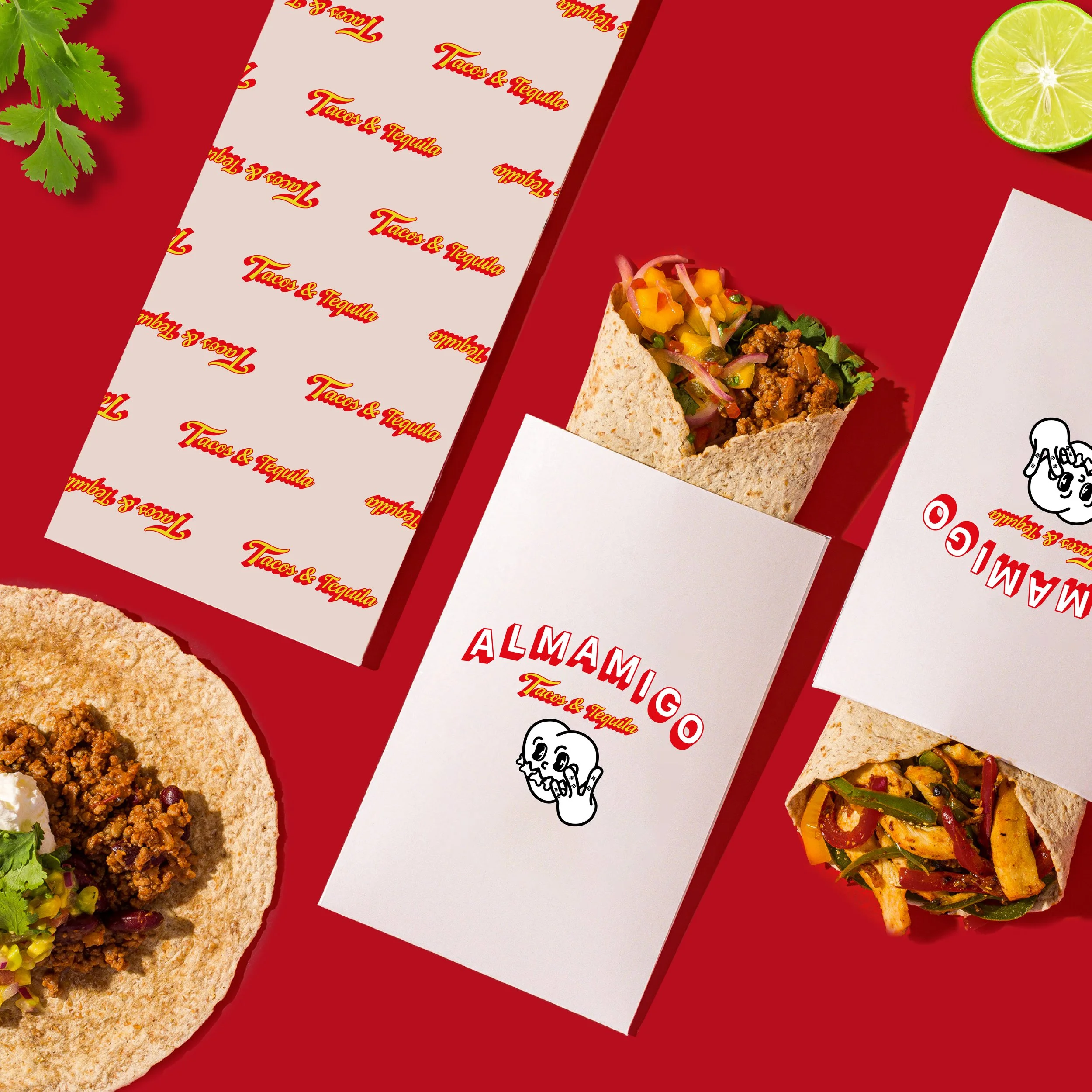
Almamigo Taco & Tequila

19
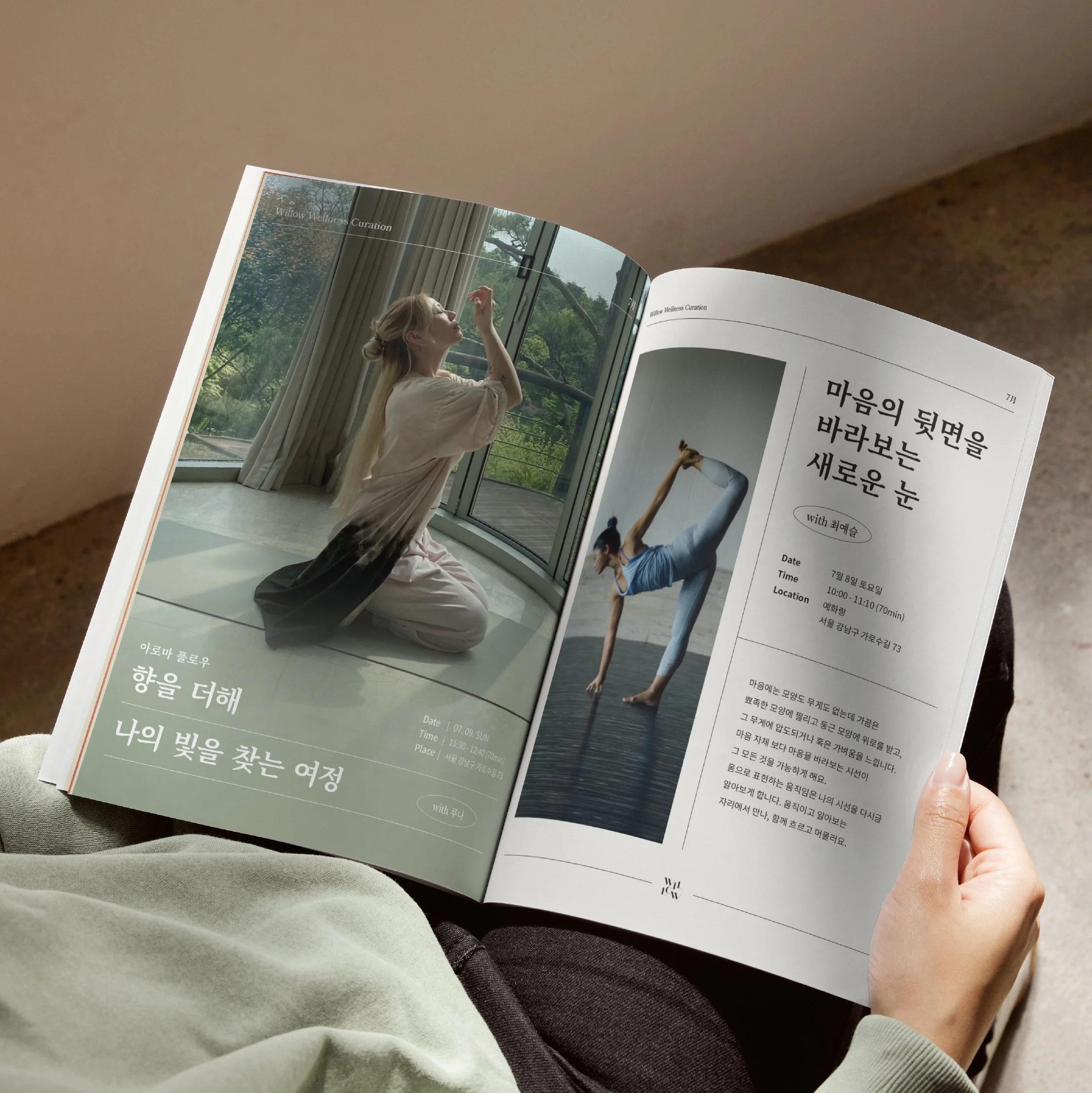
Willow Wellness Curation

14
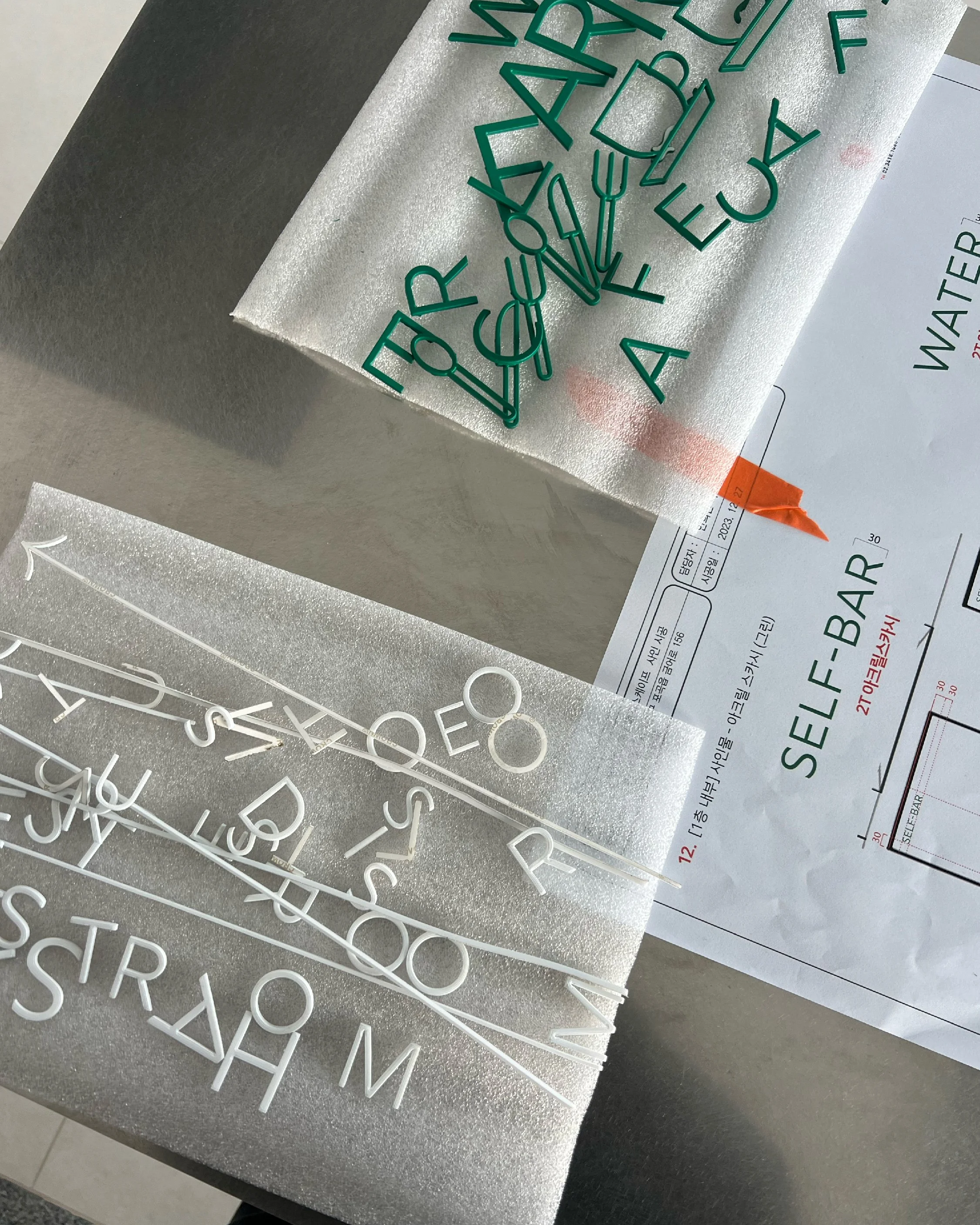
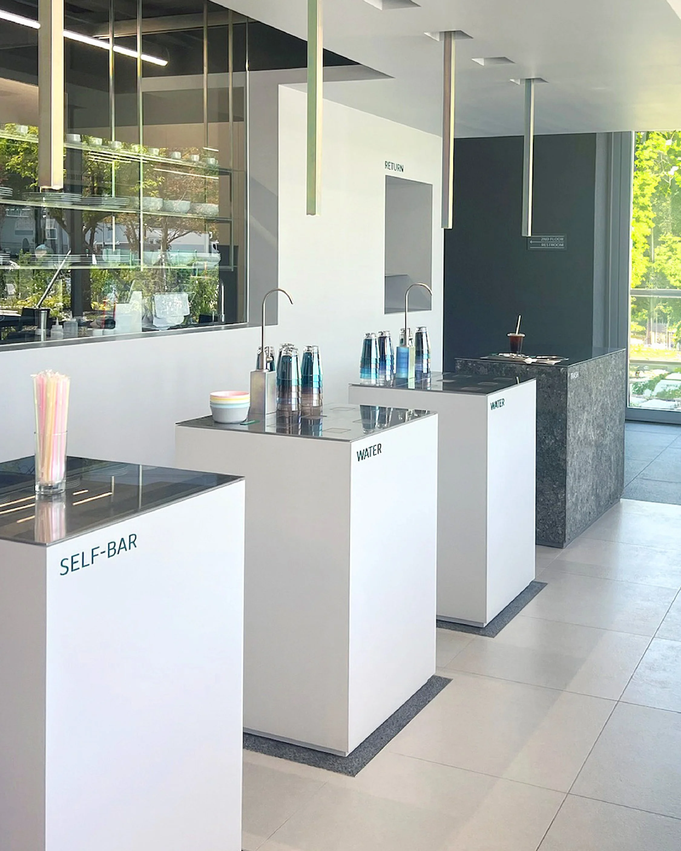
Hilo Bar

9
Carnev Salt Aging Premium Beef

23
Gymtown Rodeo

8
Gymtown Forest
1
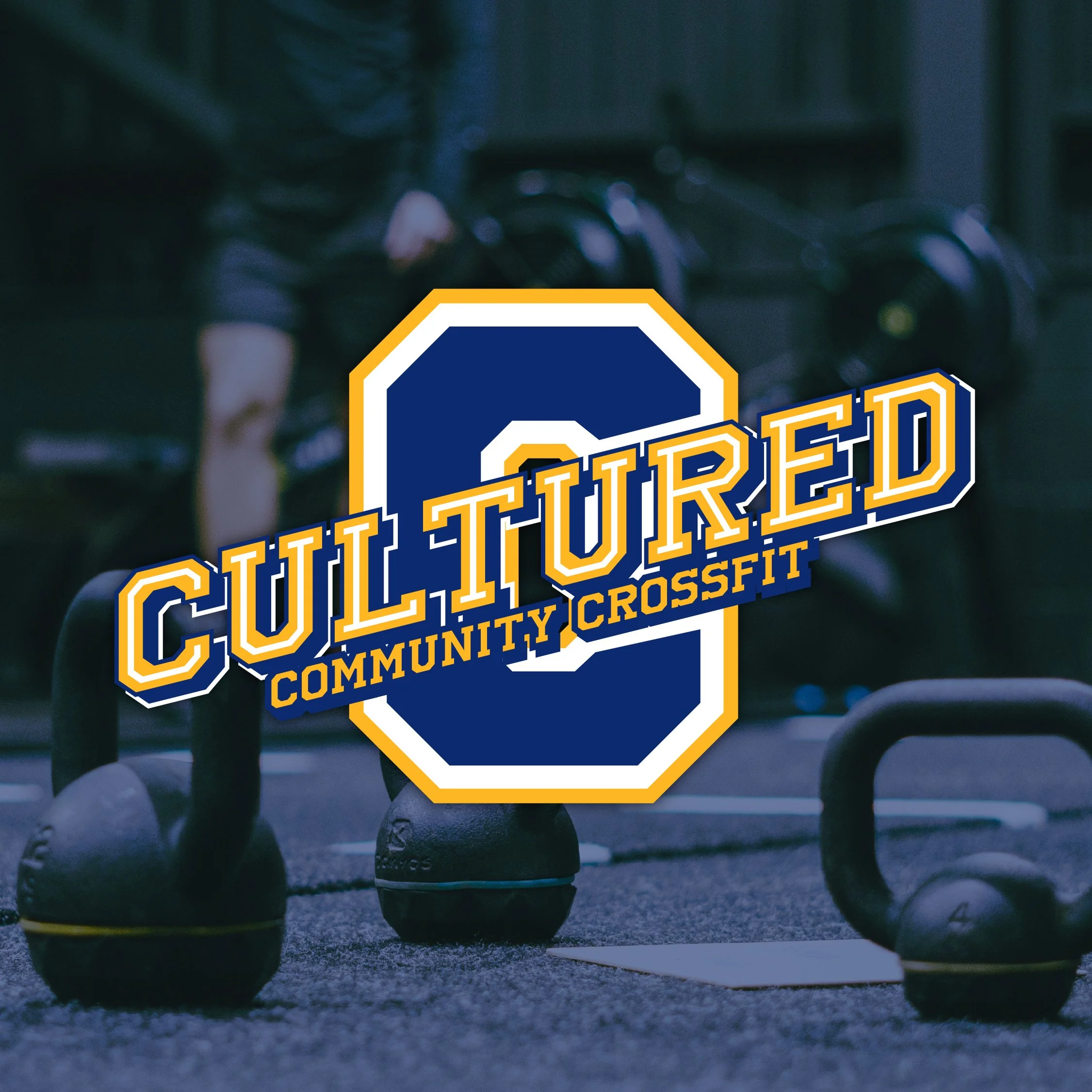
Cultured Crossfit

5
AndTree

8
Pozbe Studio

6
Seoul Danielle Psychiatric Clinic

13
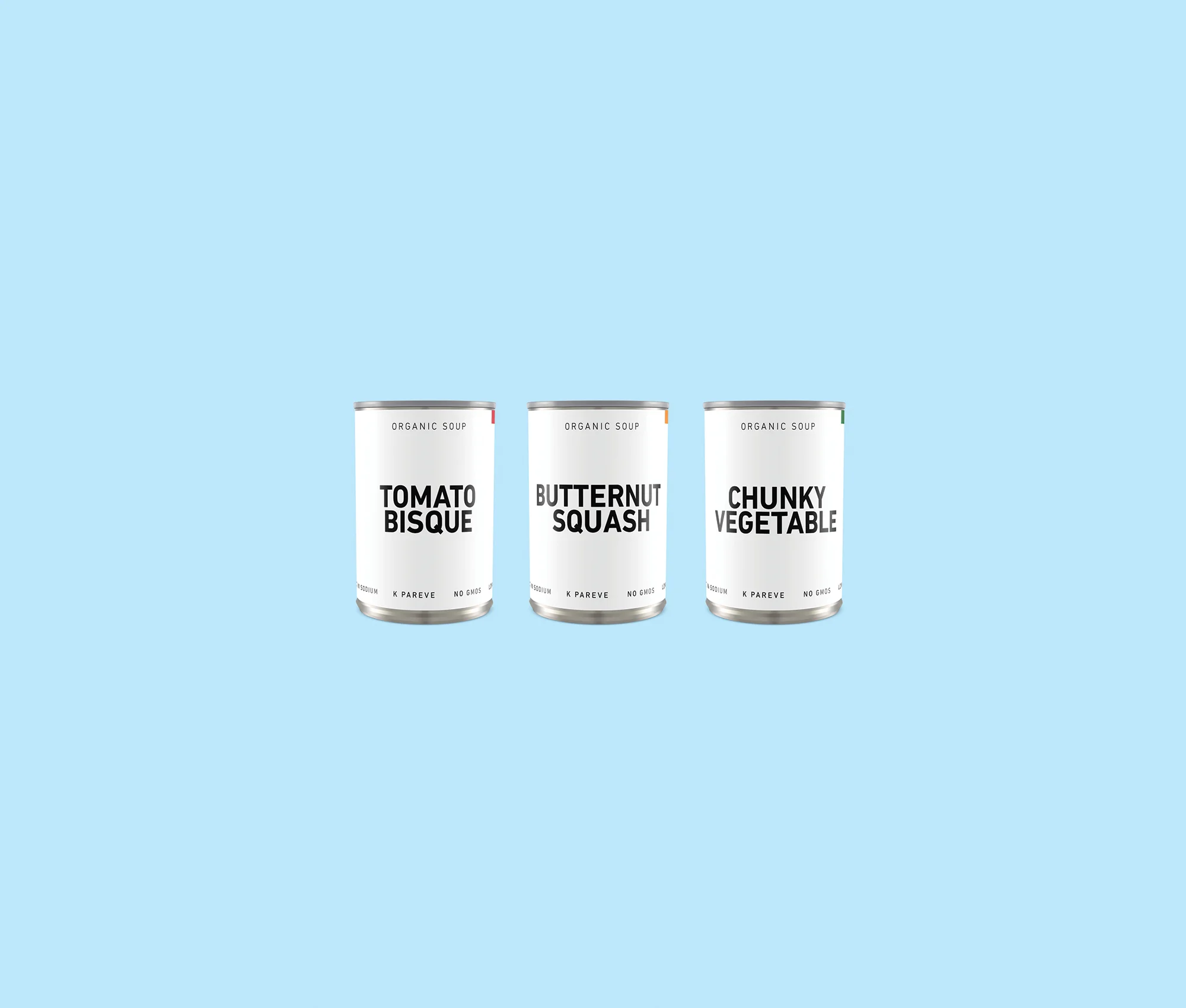
Gyeongju Groceries
0
Spinning Wolf Application Design

14
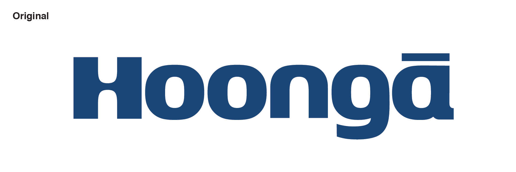
Hoonga Rrebranding

16
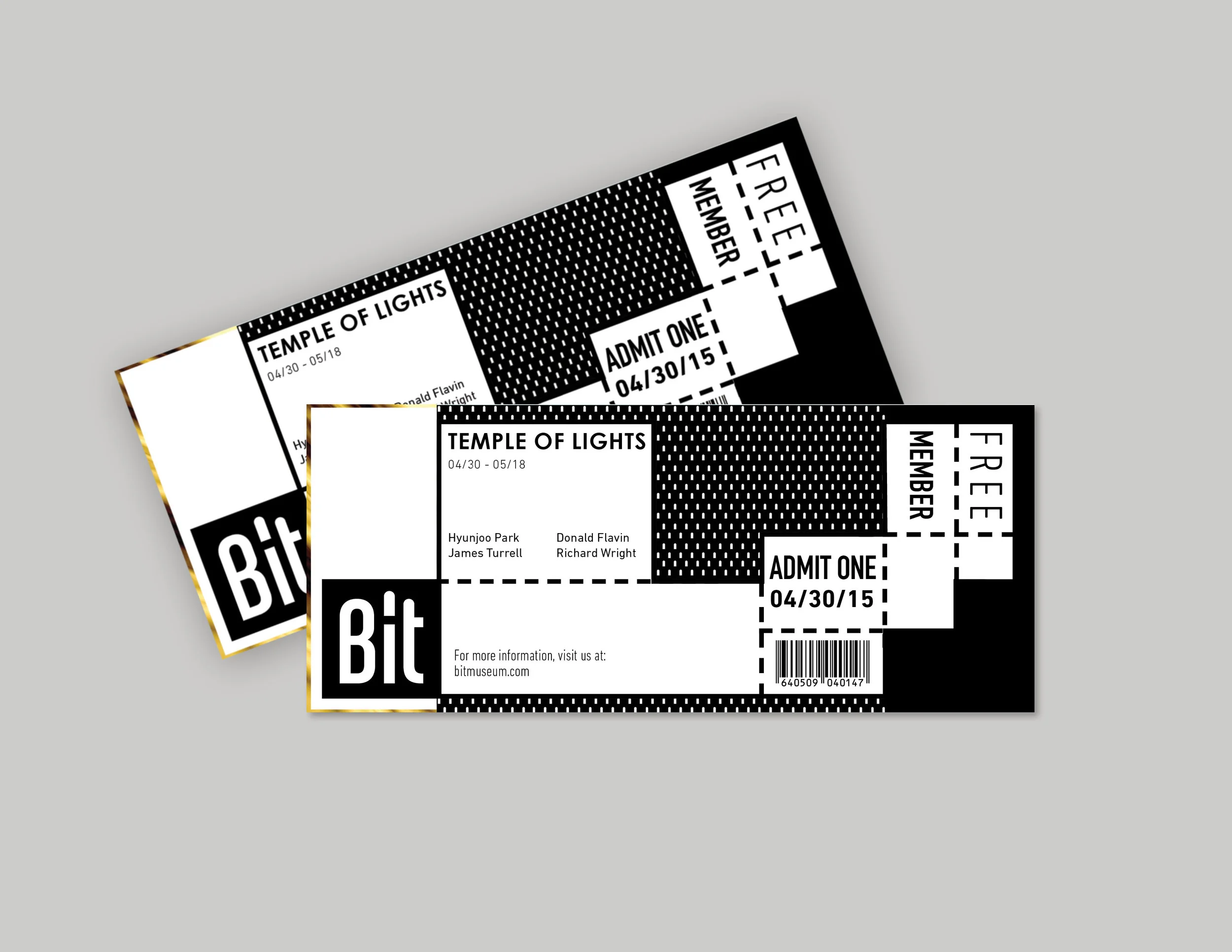
Bit Museum

10
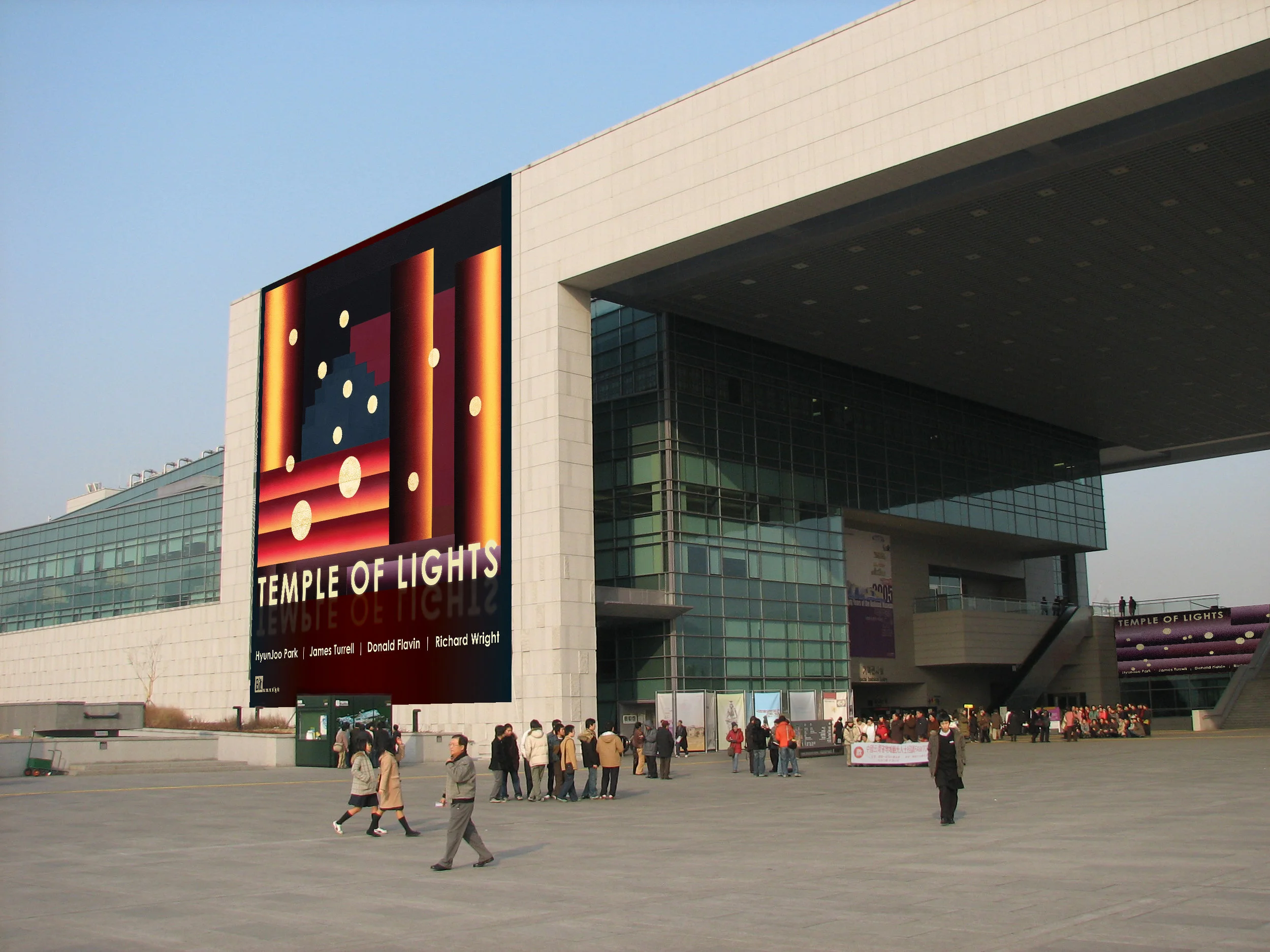
Temple of Lights

11
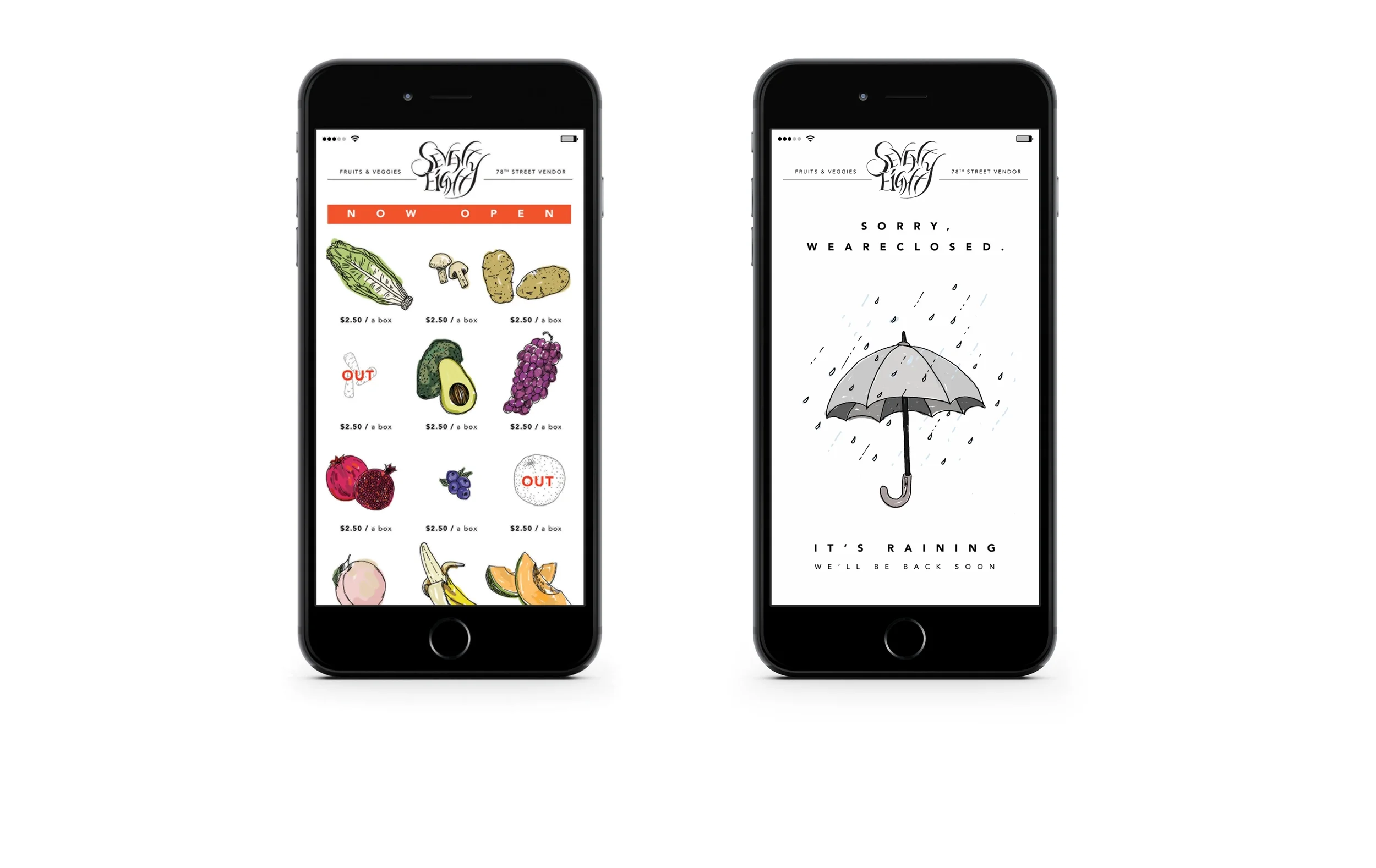
78 Fruit & Veggie Vendor

11
Simple Supermarket

5
Spinning Wolf Seongsu